Last week, AtScale announced new Excel integrations and we blogged about the ability to use Excel as a powerful business intelligence platform. In this post, we will cover the basics of using AtScale to connect Excel to a cloud data set, bypassing row limits, avoiding data extracts, and allowing analysts to leverage the flexibility of a spreadsheet based model while getting the full power of a dimensional analysis engine.
How to Connect AtScale to Excel
This example is based on connecting an Excel model to an Amazon Redshift data set through Atscale.
First, the user should navigate to the Data tab, from the “Get External Data” group open the “From Other Sources” dropdown list and select “From Analysis Services”.
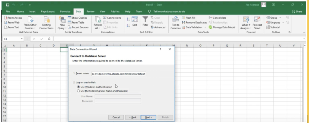
After clicking “From Analysis Services” the user is able to input information for the live connection to AtScale and use data from the Amazon Redshift warehouse without being moved or extracted. The user is able to select the “Use Windows Authentication” option to connect to the active directory and leverage existing access control policies.

The user is now able to view a list of available data models and select one to work with. The models in the list are those the user has access to within the limits of the enforcements of the security policies set forth by the admin.
After which the user is able to click “Finish” and create a pivot table or chart that leverages the power of AtScale’s security, governance, and speed of thought queries and cloud data warehouses on Excel, using the measures and dimensions organized by AtScale.
Finding Actionable Insights with Excel through AtScale
In another example based on a recent webinar with Fousquare, (How to Merge Places (POI) Data with Additional Dataset to make Smarter Decisions), we look at using point-of-interest data to analyze potential locations for a new retail outlet. POI data is merged with first-party sales data in AtScale, ensuring consistency and uniformity. This allows the data team to get the same data, regardless of what tool is being used (Excel or Power BI).
Using Excel, we are able to create a pivot table and chart to analyze the total sales amount by location and product. Creating these pivot tables and charts is made easy by AtScale’s organization of measures and dimensions, shown on the PivotTable Fields list on the right of the Excel window.
From our pivot chart analysis, we found that the majority of our sales are coming from California. It would be a good idea to look further into opening a new store somewhere in California.
Now that we know what state is generating the most income for our business, we next look at when would it be the best time to open up our new store. To answer this business question, we take a look at the total sales amount over time, using an Excel pivot chart/ table. We are able to see there is a positive trend of our total sales in the current/ 4th quarter of the year, an indication of a good time to open up our new store!
To watch the full webinar, click here.
Summary
This has been a practical, step-by-step example of connecting an Excel PivotTable (or PivotChart) to an AtScale semantic layer on a cloud (Redshift) data set. We will continue our series on Excel and AtScale with a discussion of alternate approaches to connecting Excel to AtScale as well as an in depth look at Excel’s dimensional analytics capabilities.


SHARE
Case Study: Vodafone Portugal Modernizes Data Analytics