
Wouldn’t it be great if you could load all of your data from a single file into an Excel pivot table for easy analysis?
Unfortunately, this approach isn’t usually viable when dealing with complex business analytics and big data. Take for example a typical use case found inthe world of healthcare insurance. A large insurance provider has 10s of millions of members, and processes 100s of millions of claims a year. As flexible as Excel is, we all know it won’t handle this volume or velocity of data.
As a result, more and more enterprises store large data sets in big data platforms like Hadoop. And while Hadoop provides a low-cost and performant approach to store and process this information, there is still the challenge of supporting the many types of analytics required on claims and member data sets. But why? Why and how, with all of the advances in technology, can a simple calculation cause so much complexity?
HOW A SIMPLE CALCULATION INTRODUCES COMPLEXITY
One common analysis in the health insurance space is the “Per Member Per Month” calculation, also known as PMPM. Essentially the PMPM formula is:
(Cost of Claims for Month N) / (Total Active Members for Month N)
At a high level, this is a very simple formula – however it becomes challenging when additional dimensions are added to the analysis. For example:
- Question #1: What was the PMPM for members belonging to a specific plan type?
- This requires jointly filtering both claims and member metrics by plan membership, for example filter on PPO only.
- Question #2: Within the PPO membership base, what was the distribution of cost across the top 10 diagnosis types?
- This is where things get more complicated – while the claims metric can be grouped by diagnosis type, there is no such association with the member.
- For this analysis the cost of each diagnosis type should be normalized by the total number of active PPO members for the month, which is a constant across all claims.
- Question #3: For the most expensive diagnosis type as measured by PMPM, which providers contributed the most to this cost?
- Once again, this requires drilling even deeper into the associated set of claims dimensions while keeping the count of active members constant across the evaluation.
THE CHALLENGE WITH TABLE-BASED MODELS
Conceptually, a model that supports the use case described is shown here in Figure 1.
Figure 1: Fact Tables = Blue Dimension Tables = Green
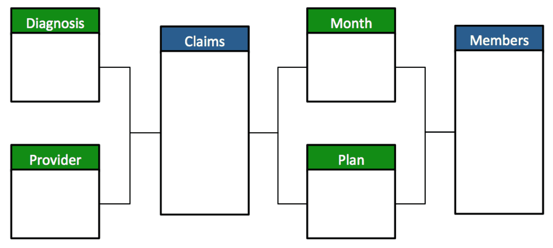
A challenge arises when measures from multiple fact tables (in this case, Claims and Members) need to be evaluated across dimensions that are not shared by both facts. For example, how should a query that tries to group “Member Count” by “Diagnosis Code” respond?
- The Problem: The need to evaluate measures from multiple fact tables across dimensions that aren’t shared by both fact tables (what we refer to as the “unrelated dimensions” dilemma)..
- The Traditional Query Response: Since not all members have claims corresponding to a specific Diagnosis Code, a naive query would simply return the count of members with a claim matching that code.
- The Right Query Response: For accurate analysis, what is required is the count of ALL members, regardless of claims activity.
THE BETTER APPROACH
To solve this problem, an additional business semantic layer is required that abstracts away the underlying table structure. In addition, the semantic layer asserts the appropriate business logic and data handling instruction sets that enable the complex business analysis described in earlier scenarios. In AtScale this is achieved through a combination of our multi-fact model support along with the ability to specify how to handle the “unrelated dimensions” dilemma described above.
To support the calculation of complex metrics like PMPM, AtScale provides the ability to evaluate a measure while ignoring unrelated dimensions. When using this feature, Modelers can specify whether to show empty values or repeating values for the rows of the result set where the non-related metric as being applied. In PMPM the “repeating values” option allows the normalization of claims metrics – grouped or filtered any claims dimension – to be compared to a constant population of members. This results in the ability to generate results like Figure 2 shown below.
Figure 2: Per Member Per Month Sample
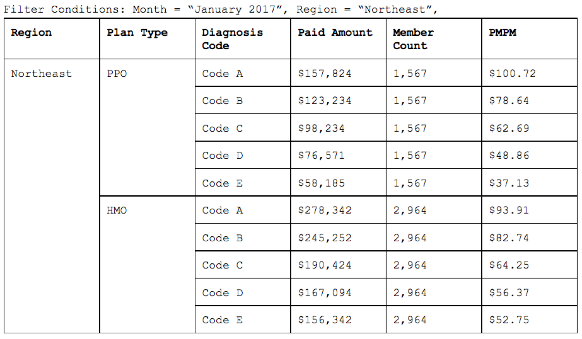
The end result…accurate Diagnosis code + Claim amount calculated across ALL members, even though fact tables aren’t shared across the member dimension!
PER MEMBER PER MONTH IN ACTION
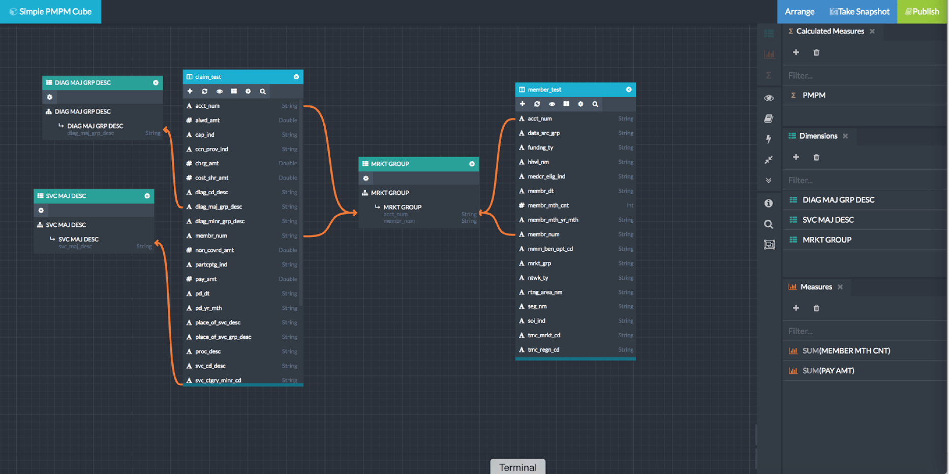
With this background on the complexity and desired results of evaluating the ‘Per Member Per Month’ metric in healthcare, let’s take a look at how the AtScale Intelligence Platform makes this happen. For this example, we’ve created a simple multi-fact model in the AtScale Design Center shown in figure #3 below . This model has…
- A Members fact table
- And a Claims fact table
- Both of which have a shared relationship with the “Market Group” dimension.
- Additionally, the Claims fact is related to the Service Description and Diagnosis Description dimensions.
Figure 3: A model with two base measures 1) Sum of Member Count 2) Sum of Payment Amount
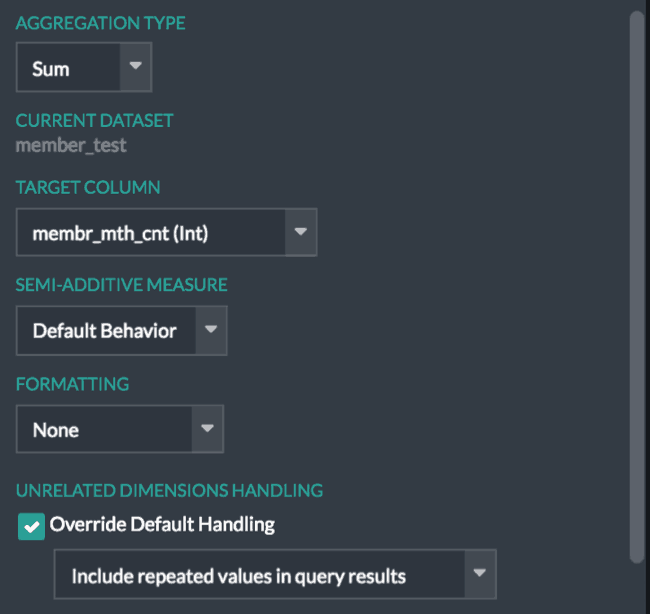
To ensure the desired behavior when evaluating the Member Count metric relative to the unrelated Service Description and Diagnosis Description metrics, the “Unrelated Dimensions Handling” (Figure 4) can be set to show repeating values for queries involving group-bys on unrelated dimensions.
Figure 4: Unrelated Dimension
Once the base metrics have been designed a calculated measure (the PMPM metric) can be defined as in AtScale using MDX as:
(Measures).(m_pay_amt_sum) / (Measures).(m_membr_mth_cnt_sum).
Upon publication, the AtScale PMPM Virtual Cube can be queried using any BI front end that uses either SQL or MDX query language. This means that different BI tools like Excel , Tableau, and MicroStategy can all be used to query the same virtual cube. Let’s look at how the PMPM metric is analyzed using Tableau.
As shown in the video, the user of a BI tool like Tableau is shown a simple interface – measures and dimensions – that abstracts away the need to understand the relationships between the various underlying tables. Additionally, the end user is able to easily evaluate all of the available measures across all of the dimensions in the cube. When unrelated dimensions are involved, the AtScale virtual cube returns repeating values (for example 21 members in Florida) across all of the claims related costs for different diagnoses. AtScale abstracts away the complexities underneath, and delivers the accurate result, even when unrelated dimensions are involved.
In any larger organization, there are a number of BI clients in use. This includes the world’s #1 BI tool, Excel; as referenced at the start of this blog – wouldn’t it be great to also be able to use Excel to analyze this same data set? With AtScale’s unified semantic layer, this is possible. Since AtScale acts as an XMLA data provider, Excel users can connect live to the same AtScale PMPM virtual cube as if it were a SQL Server Analysis Services cube and query that large dataset with the same ease and accuracy as the Tableau can. Take a look at this quick video view of what the experience is like in Excel.
Wow, right?! If you weren’t at least mildly excited, show this to your Head of Data platform or architecture, a business analyst, or even data scientist. I’ve worked in the big data and BI (aka analytics) space for over a decade. What you just read about is NOT easy. I’ve seen enterprises struggle with supporting analytics like this and go through what they’ve described as ‘query script gymnastics’ to achieve an accurate end result. And now, it’s possible; without the gymnastics.
AtScale is the only business interface provider that supports native MDX and SQL queries against the same underlying cube definition, using both a big data platform and BI tool of your choosing. The end result is that all your BI users get the same answers, even if different tools, at the speed of thought, and without moving data.
IN CONCLUSION:
When it comes to doing business analysis, it is imperative to remember a few key points that will help you and your business users connect the dots when dealing with the sometimes messy world of data and unrelated dimensions that in the real world ARE related.
- Think about Your Users: Provide an interface that can model and express data in a form that matches the concepts in the mind of the business analyst
- Simplify the Complex: Abstract away the complexity of underlying tabular relationships.
- Details and Accuracy Count: Simple sums, roll-ups, and counts are not sufficient to support the multi-level and multi-fact questions that business analysts need to answer.
With AtScale, enterprises are able to satisfy the requirements of complex business analysis, even on the on the largest of data sets.
I hope this post helps shed some light on why the challenging world of unrelated dimensions, like Per Member Per Month (PMPM), is so complex and hard to address. I hope also that I was able to introduce an approach that might help you think about and address your own challenges in that area.
If you have experiences and other thoughts when it comes to analysis of unrelated dimensions, I’d love to hear them. Please share a comment, or share this with others you know. It’s all about educating each other, and coming up with innovative ways to solve age old problems.
~ Josh
SHARE
Guide: How to Choose a Semantic Layer