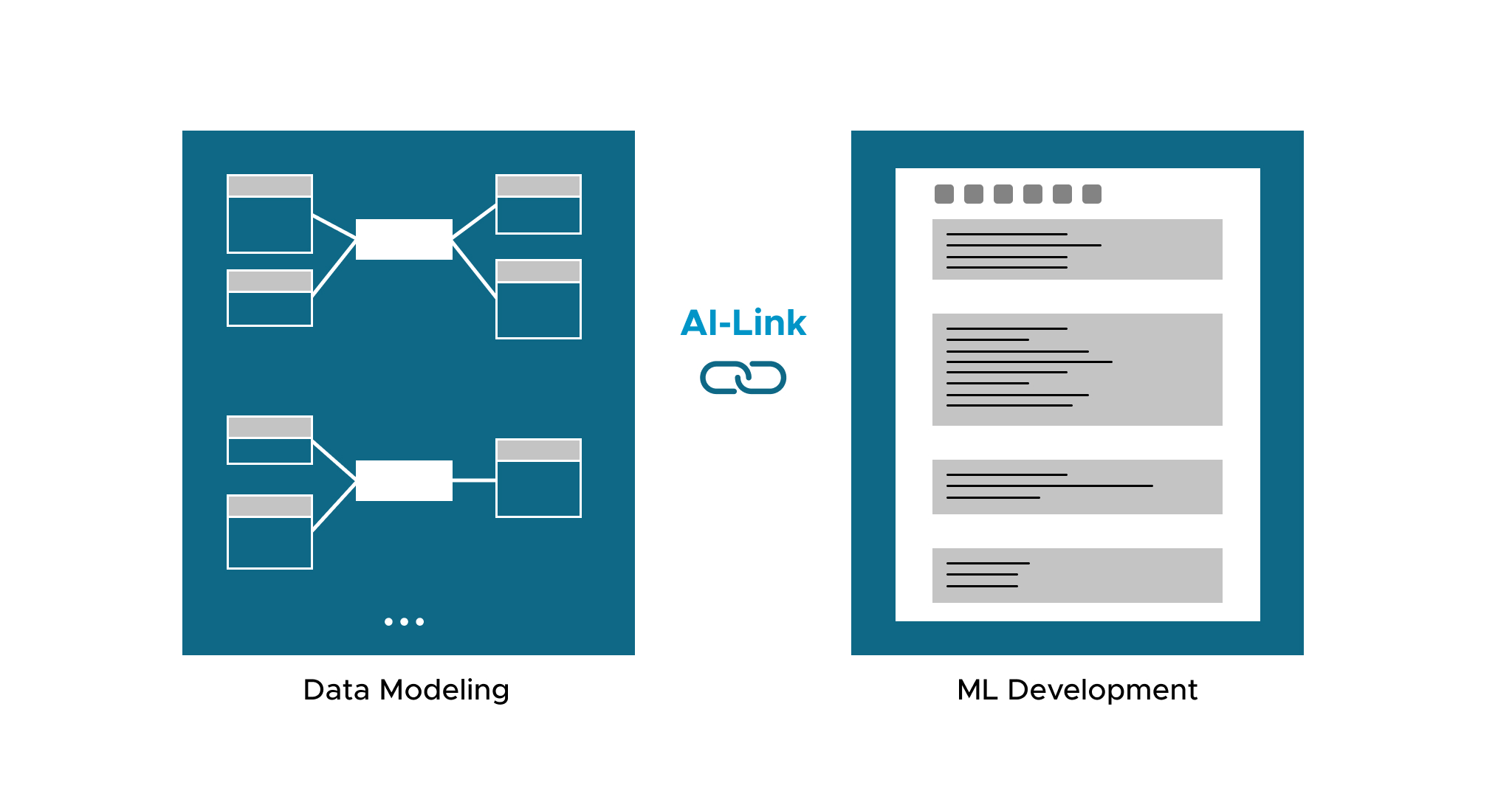
AtScale’s semantic layer allows users to have one single place to define business constructs like KPIs (i.e. time series calculations) and first-class dimensionality/hierarchies (i.e. time, geography, product, customer, etc.). Whether you are on the business intelligence (BI) or data science team, you can always get access to consistent business results using whatever tool you are comfortable with, be it a BI tool,Python, or data science platform.
This blog will be about demonstrating AtScale’s AI-link capabilities to show how we can bridge BI teams and data science teams, enabling data scientists to publish predictions for BI teams. In turn, BI teams can easily slice and dice the prediction to better understand the business value. We will be demonstrating these concepts using a dataset derived from Kaggle called the M5 Forecasting challenge.
Using AtScale for Feature Engineering
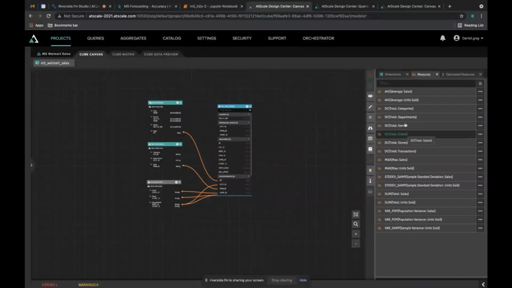
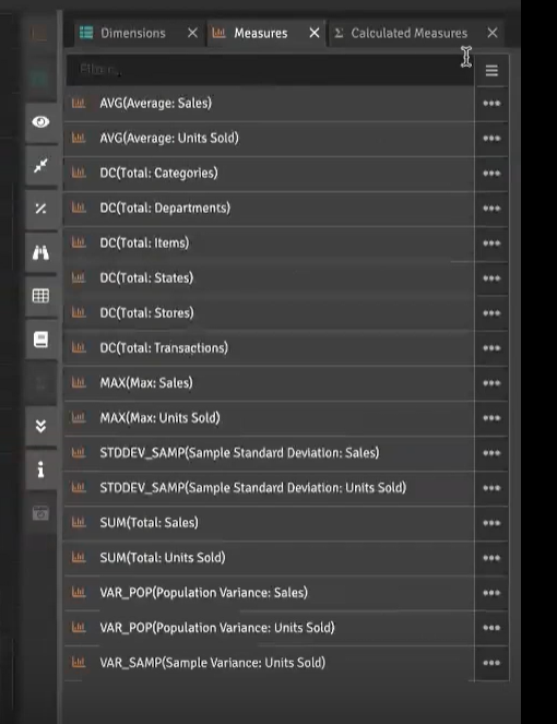
First, we use the AtScale modeling tool to design features to work with in our models. Using the AtScale modeling tool, we can easily build relationships, build dimensionalities, and define hierarchies. For BI use cases, data teams use the modeling tool to create the metrics and dimensions for developing reports, ad hoc dashboards, and descriptive analytics using the BI tool they are most comfortable with. This is all possible without ever writing a line of SQL. The same approach can be used by a data scientist to build the features they want to expose to their ML models. In either case, AtScale lets users quickly define the metrics or features they want to work with and not worry about complicated data wrangling or data engineering .
Simplifying Data Pipelines
Once the AtScale user publishes their model, the metrics or features are immediately available for use. The data pipeline is instantly created no matter the complexity of the model. This removes the need to worry about consistent code for all of the calculations, complex queries, joins, dimensions, and more. We want to make the life of a data scientist easier,so that they can do what they do best without waiting on data engineering to make these features available to them.
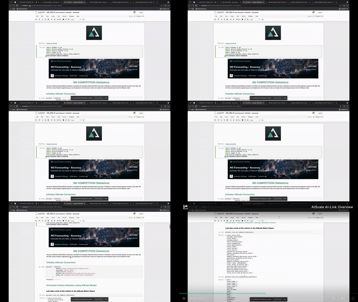
Below is an example Jupyter Notebook showing how to get connected to the AtScale model as well as tapping into all of the business features and metrics that are derived from the AtScale model.
Working with a Semantic Layer Using AI-Link
You can use a simple API to pull whatever features you want, then create a dataframe of that data. There are no views, joins, nor a single line of SQL. Instead you only need to choose what features you want, making it easier and faster to get started with predictive data modeling.
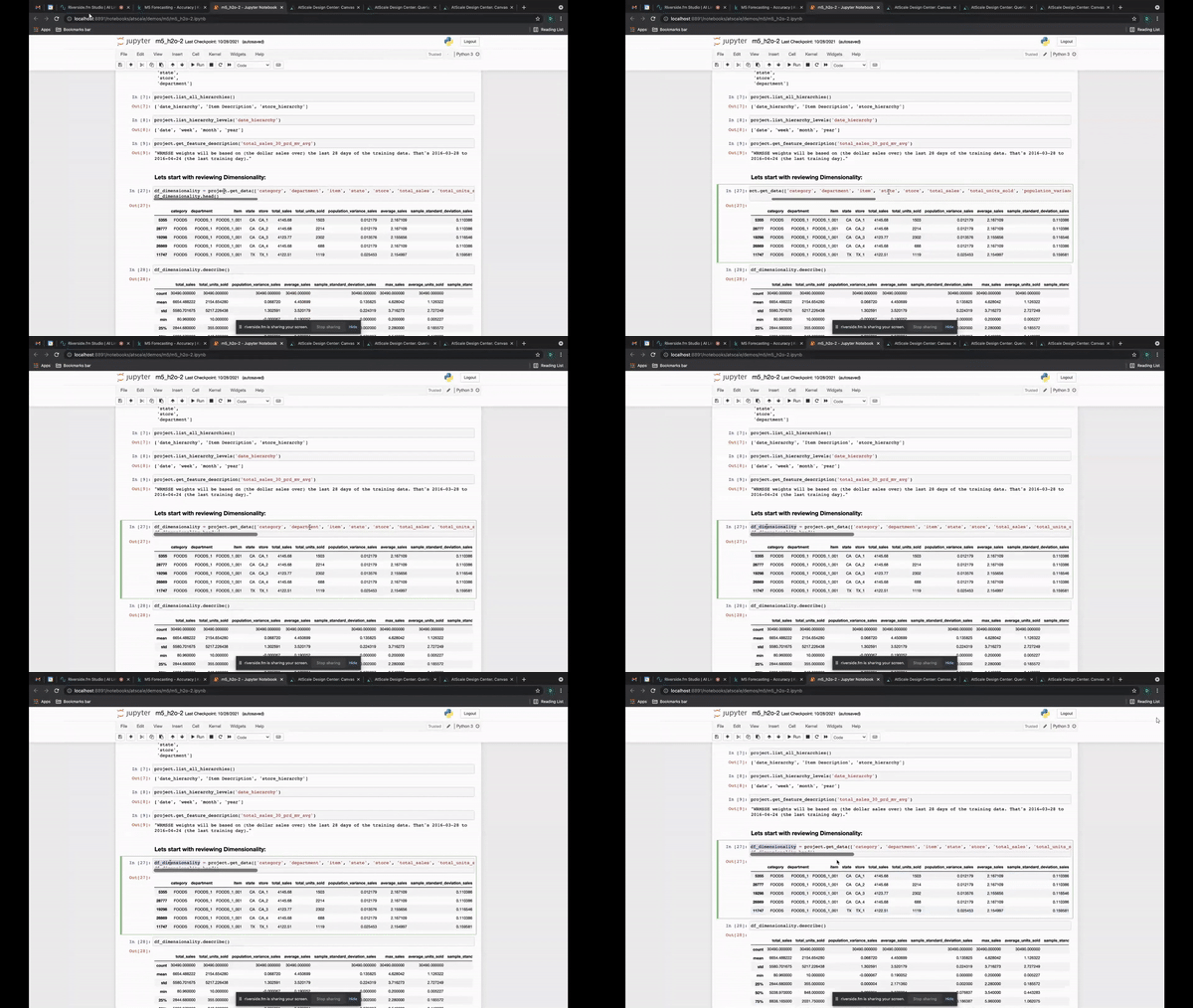
The image below shows how complex the query would be if a data scientist had to query this data directly. Obviously you can write this as a data scientist, but AtScale provides a way to eliminate those complexities and creates a consistent way of getting your data. It also ensures that all data scientists get consistent features. What are the chances that ten different data scientists write the same query and get the same results?
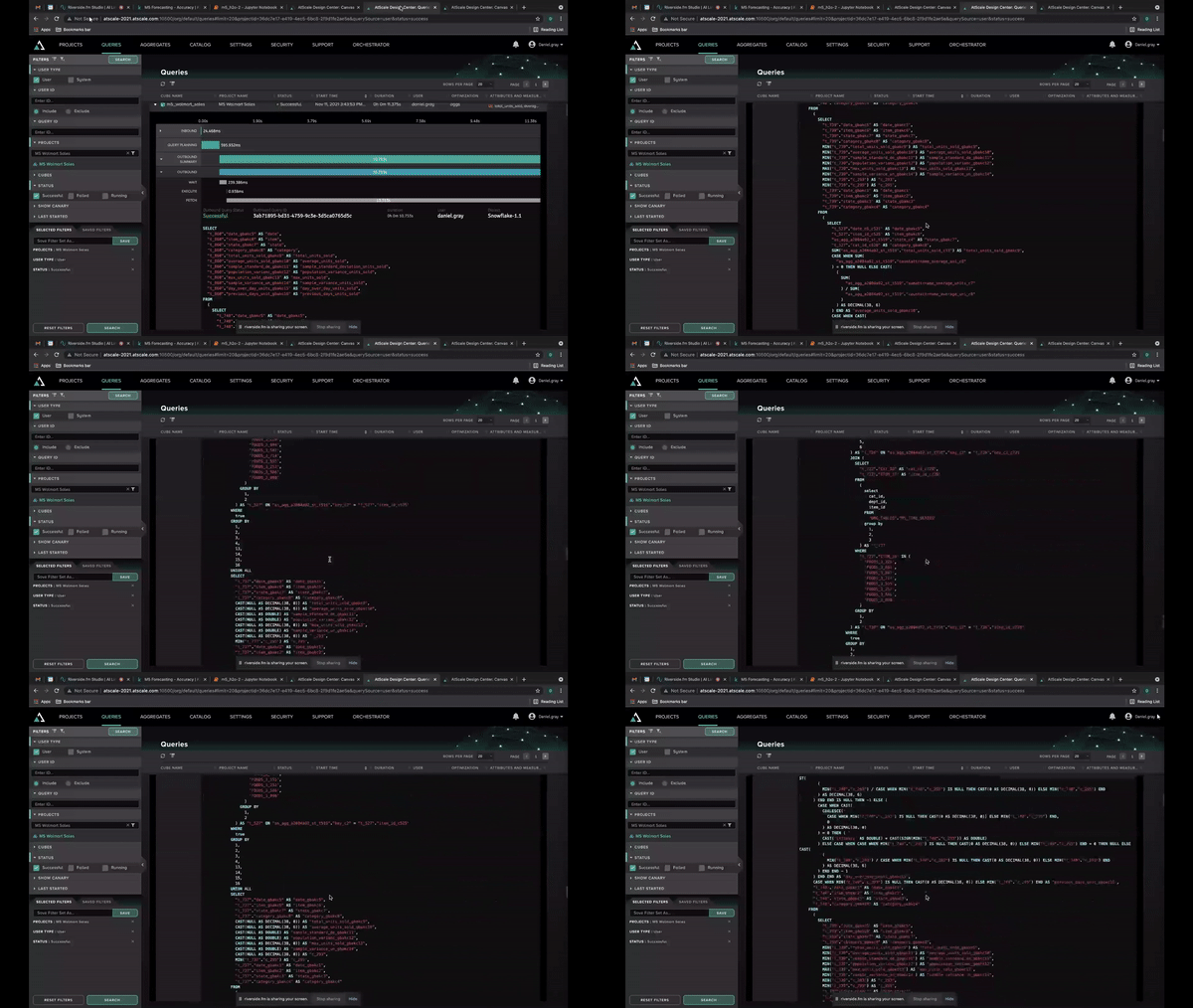
You can easily use the data to create new features, then create a dataframe that is used as the basis for training your model as seen below.
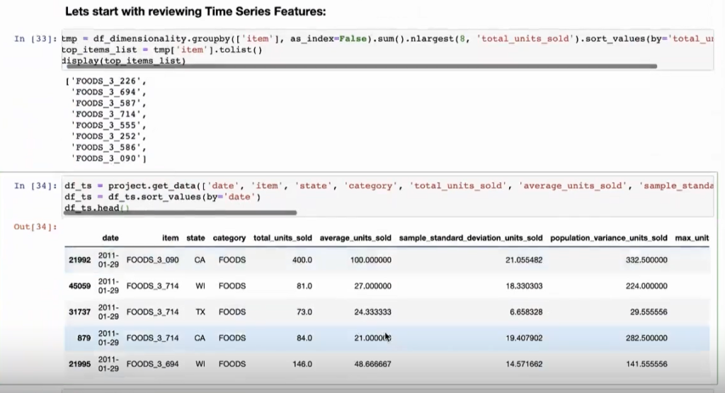
These features can easily be filtered by dates or any other criteria.

Simplifying Time-Relative Feature Creation
In addition, AtScale understands the concept of time, so you can generate time series features by setting different intervals like we see below. This greatly reduces the logic necessary to build windows and also reduces the risk of incorrectly defining time series features. After, you’re ready to train different models to determine which performed the best and what features were of importance.

Below shows the most important feature during training as “total units sold 7 day sum”, which was a feature AtScale defined on the fly (code snippet from above) and doesn’t exist in the AtScale model as of yet.
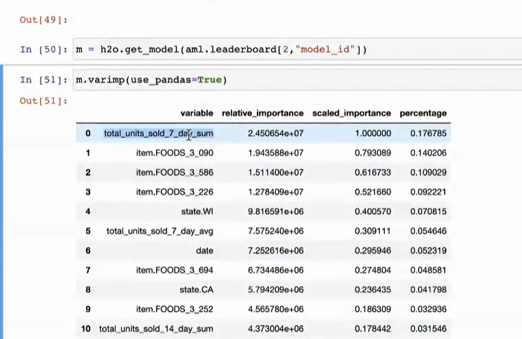
Now, as a data scientist, I can go back and actually add this feature back into the semantic layer. This enables other data scientists to use this feature and your BI teams can use it, which goes back to bridging these two teams together using the same business concepts in a very natural way.

Comparing Actual vs. Predicted Values
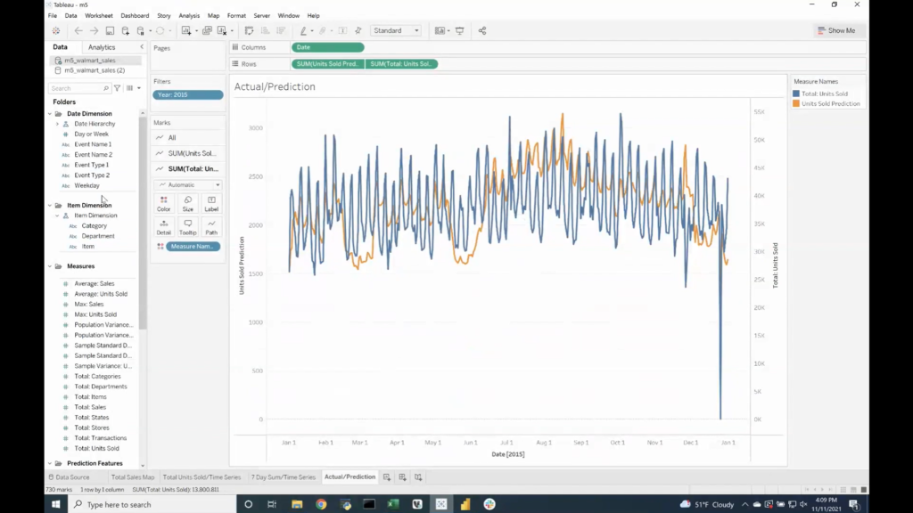
Whenever you have tested your model and created predictions, it makes sense to view those predictions against the actual values. AtScale does all of this for you along with tying your prediction back into the AtScale model so that you can evaluate it by all the other business concepts defined in your AtScale semantic model (first-class dimensionality, hierarchies, etc).
Therefore, you can begin to see how your predictive model did per store, per unit, over different periods of time, geography, etc. This measures the value and business impact of the prediction, which then can be implemented into dashboards to clearly show that impact! An example can be seen below showing actual vs. predicted, which can then be sliced and diced by various categories.
In order to do this, let’s write back our prediction to the underlying data platform.

Then create a new feature in the semantic model.
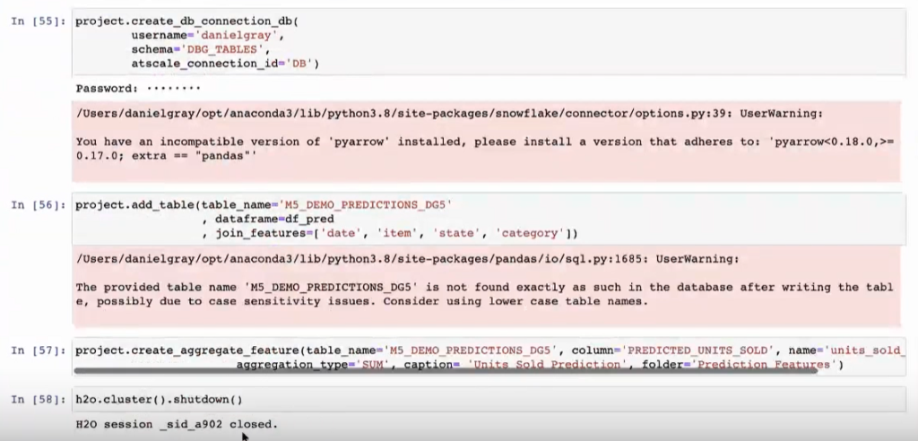
And now we have our predictions modeled into AtScale as well as those new features that anyone can see and use for their analysis, whether that be Tableau, Excel, Power BI, or another tool.
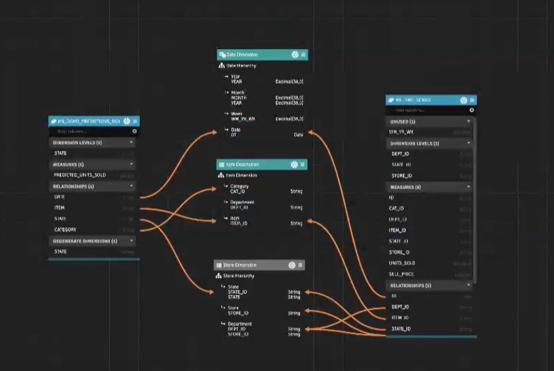
In summary, AtScale allows for a single layer to enable the same business constructs like KPIs, hierarchical data, and first-class dimensionality across your organization. This creates a unique and comfortable ecosystem where everyone has access to the same answers, features, data, etc., which enables all teams at all times to quickly make data-centric decisions in order to drive value to your organization.


SHARE
2026 State of the Semantic Layer