Dave Langer founded Dave on Data, where he delivers training designed for any professional to develop data analysis skills. Over the years, Dave has trained thousands of professionals. Previously, Dave delivered insights that drove business strategy at Schedulicity, Data Science Dojo, and Microsoft. Follow Dave on LinkedIn.
Empowering Excel Analysts
Welcome to the second in a series of blog posts showing how AtScale empowers Microsoft Excel users to conduct powerful data analyses.
This blog series is specifically designed for professionals who use Excel. As such, the following principles will guide this blog series:
- The primary focus will be analyzing data using Excel PivotTables.
- Technical details not related to Microsoft Excel will be kept to a minimum.
- Helping Excel PivotTable users learn new features to assist with data analysis.
Throughout this blog series, I will use the term “Excel Analyst” to refer to any professional who analyzes data using Excel PivotTables.
In my experience, the population of Excel Analysts is easily 100+ million professionals worldwide. The goal of this blog series is to help as many of these professionals as possible to achieve more. In this analysis, I use the AtScale Semantic Layer Platform to connect my Excel PivotTables to live cloud data to do high-performing, real-time analysis without any data extraction. Read on to learn how to use Excel PivotTables to perform time series analysis with real-time data without any data extraction.
The Scenario So Far
For a complete description of the hypothetical scenario used in this blog series, and for some data background, check out the Part 1 blog post.
So far, you have connected to the AtScale data model and performed initial data explorations.
Specifically, at the direction of the Director of e-commerce, you’ve been investigating the performance of Average Order Value (AOV) for e-commerce sales over the past few years.
While the Director of e-commerce is held accountable for many Key Performance Indicators (KPIs), she is under increased pressure regarding AOV.
Your mission is to analyze the data and provide options for increasing sales and (ideally) AOV.
Using the AtScale data model (aka “the data model”) provided by your IT department, your initial analyses revealed two e-commerce sales trends:
- Overall e-commerce sales show a strong upward trend starting in July 2007.
- The e-commerce AOV experienced a significant drop starting in July 2007.
Exploring the Products
Your analyses have confirmed the “what” – the e-commerce AOV has experienced a significant drop while overall e-commerce sales have grown.
However, the Director of e-commerce wants insights into the “why” AOV has dropped. To find the “why,” you must dig deeper into the data.
The natural place to start your digging is with product sales over time.
The Product Dimension
One of the dimensions provided by the data model organizes the data via product attributes.
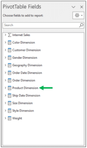
Fig 01 – The Data Model’s Product Dimension
Expanding the Product Dimension displays how your IT department has already modeled products into a hierarchy.
Clicking on Product Hierarchy will add the hierarchical data as rows in a PivotTable.
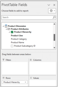
Fig 02 – Adding the Product Hierarchy to a PivotTable
Fig 02 shows that the data model has defined the product hierarchy like this:
- Product Line
- Product Category
- Product Name
- Product Category
Exploring the Product Hierarchy
As a new employee, you are familiar with the e-commerce products at a high level. That is, you know that your new employer sells bicycles and bicycle-related products via the company’s website.
This level of knowledge is insufficient to get to the “why” of what’s going on with AOV. What you need is more detailed knowledge regarding the various products sold online.
To build this knowledge, you expand the product hierarchy in the PivotTable to display the product names by:
- Right-clicking with your mouse on one of the product lines.
- Select Expand/Collapse from the menu.
- Select the Expand to “Product Name” option.
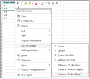
Fig 03 – Expanding the Product Hierarchy
By expanding the hierarchy, Microsoft Excel will fetch the data from the AtScale server and update the PivotTable.
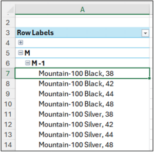
Fig 04 – Product Names for the “M” Product Line
Fig 04 shows that the “M” product line includes all products related to mountain bikes, including entire bicycles, parts, and accessories.
By continuing this expansion process for the other products lines, you quickly learn the following:
- The “R” product line is all products related to road bikes.
- The “S” product line is all miscellaneous products.
- The “T” product line is all products related to touring bikes.
Product Line Time Series Analysis
Time series analysis looks at the behavior of measurements over time. When performing time series analysis, five patterns provide you with essential insights:
- Trend – The overall tendency for a series of values to increase, decrease, or remain relatively stable during a period.
- Variability – The typical change between subsequent data points over time.
- Cycles – Patterns that repeat regularly (e.g., hourly, weekly, monthly, etc.)
- Rate of Change – The percentage difference between subsequent data points in a time series.
- Exceptions – Values that fall outside a typical range for a given time series.
Microsoft Excel line charts are your go-to method for visualizing time series data. In particular, PivotCharts are very effective for analyzing time series data.
Configuring the PivotTable
The first step in getting to the “why” of what’s happening with AOV is to analyze e-commerce sales by product line over time.
Luckily, the data model makes performing this time series analysis straightforward by using a PivotTable to feed data to a PivotChart.
First, you add the Sales Amount measure from the data model to the PivotTable.
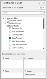
Fig 05 – Adding Sales Amount to the Pivot Table
Next, you add the Order Date Month Hierarchy dimension to the PivotTable.
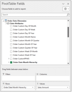
Fig 06 – Adding the Order Date Month Hierarchy to the PivotTable
Lastly, you add the Product Hierarchy dimension to the PivotTable.
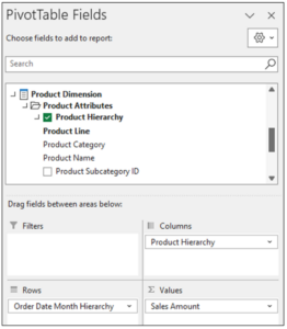
Fig 07 – Adding the Product Hierarchy to the PivotTable
By default, the PivotTable isn’t in a format suitable for conducting a time series analysis using a line chart. The PivotTable must be expanded to display monthly sales data by product line.
You select all the cells in the PivotTable’s first column and then:
- Right-click with your mouse.
- Select Expand/Collapse from the menu.
- Select the Expand to “Order Month” option.

Fig 08 – Expanding the Order Date Month Hierarchy
As displayed below in Fig 09, the expanded PivotTable also includes the quarters of the calendar year.
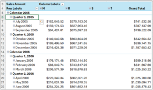
Fig 09 – The Expanded PivotTable
While including the quarters in the line chart isn’t technically a problem, it does add clutter to the visualization.
Hiding the quarters from the PivotTable is accomplished by:
- Right-clicking on one of the date cells using your mouse.
- Selecting Show/Hide Fields from the menu.
- Selecting the Order Quarter option
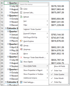
Fig 10 – Hiding the Quarters in the PivotTable
The resulting PivotTable is optimal for conducting a time series analysis using a PivotChart.

Fig 11 – The PivotTable Configured for Time Series Analysis
Product Line Sales Analysis
With the PivotTable configured, creating a line chart to conduct the time series analysis takes just a few clicks:
- Click Insert in the Excel Ribbon.
- Select Pivot Chart.
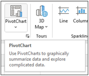
Fig 12 – Inserting a PivotChart Using the Ribbon
Using the Insert Chart dialog, select Line and click the OK button.
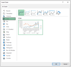
Fig 13 – The Insert Chart Dialog
The resulting line chart is excellent for conducting a times series analysis for e-commerce sales by product line.
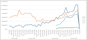
Fig 14 – The Line Chart for Product Line Online Sales
Analyzing Fig 14 provides many insights regarding the trend pattern:
- Until July 2007, only the M and R product lines were sold online.
- The R product line sales trended down from 2005 until the trend was reversed starting in July 2007.
- The M product line sales have trended up consistently starting in September 2006.
- The T product line sales have shown explosive growth starting in July 2007.
- The S product line sales are relatively small but steady starting in July 2007.
When analyzing Fig 14 for the remaining time series analysis patterns, the following jumps out at you:
- There is more variability in the M and R product lines compared to the S and T product lines.
- For the M, R, and T product lines, there appears to be some seasonality each December where sales spike (e.g., due to the Christmas holiday).
Product Line AOV Analysis
The next step for diagnosing the “why” is reconfiguring the PivotTable to show AOV by product line over time.
This is quickly done by changing the PivotTable to use the data model’s Sales Amount Avg measure.
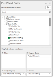
Fig 15 – Configuring the PivotTable for AOV
Excel will automatically update the PivotChart based on the AOV data values.
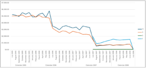
Fig 16 – Line Chart of Online AOV by Product Line
Analyzing Fig 16 provides many insights regarding the trend pattern:
- The AOV for the M and R product lines first started experiencing significant month-over-month decreases around June 2006.
- The AOV decreases “flattened out” a bit starting around September 2006.
- The AOV for the M and R product lines again had significant drops starting in July 2007 and stabilized at their new low level starting August 2007.
- Relatively speaking, the AOV for the T product line has been stable but at a level far less than what the M and R product lines enjoyed in 2005.
- The S product line’s AOV has steadily been a fraction of the other product line AOVs.
When analyzing Fig 16 for the remaining time series analysis patterns, the following jumps out at you:
- There is an exceptional AOV value corresponding to June 2006.
What’s Next?
Pivoting the sales and AOV data by product line has uncovered some interesting insights and helped explain the “why” of decreased AOV.
In the next blog post of the series, you will dive deeper into the Internet sales data to understand if consumer buying patterns have changed over time.
Until next time, stay healthy and happy data sleuthing!


SHARE
2026 State of the Semantic Layer