December 14, 2023
Empowering Excel Data Analysis with AtScale: Part 3 – Distribution Analysis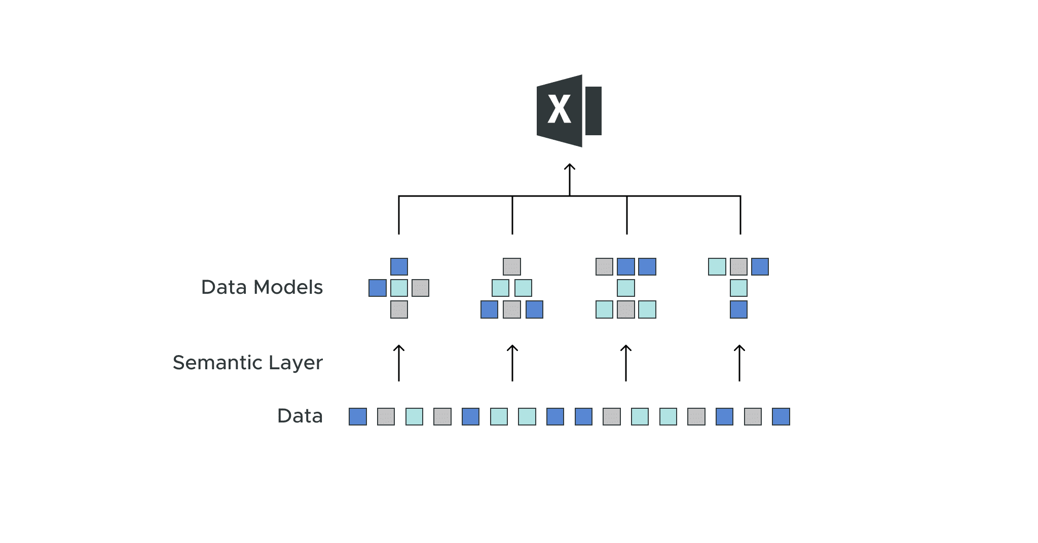
Dave Langer founded Dave on Data, where he delivers training designed for any professional to develop data analysis skills. Over the years, Dave has trained thousands of professionals. Previously, Dave delivered insights that drove business strategy at Schedulicity, Data Science Dojo, and Microsoft. Follow him on LinkedIn.
Empowering Excel Analysts
Welcome to the first in a series of blog posts showing how AtScale empowers Microsoft Excel users to conduct powerful data analyses.
This blog series is specifically designed for professionals who use Excel. As such, the following principles will guide this blog series:
- The primary focus will be analyzing data using Excel PivotTables.
- Technical details not related to Microsoft Excel will be kept to a minimum.
- Helping Excel PivotTable users learn new features to assist with data analysis.
Throughout this blog series, I will use the term “Excel Analyst” to refer to any professional who analyzes data using Excel PivotTables.
In my experience, the population of Excel analysts is easily 100+ million professionals worldwide. The goal of this blog series is to help as many of these professionals as possible to achieve more. In this post, I will walk you through how to connect your Excel PivotTables to live data stored in cloud data warehouses like Snowflake and Databricks, using the AtScale Semantic Layer Platform. This will enable any Excel user to easily create PivotTables with cloud data that updates in real-time without doing any data extraction. AtScale powered Excel provides high-performing, multi-dimensional PivotTables on live cloud data.
The Scenario
I will use a hypothetical scenario to provide context for this blog series.
Imagine you’ve been hired into a new company as an “e-commerce Manager.” You were offered the job because of your relevant business experience and data analysis skills using Microsoft Excel.
In particular, the Director of E-commerce supported your job offer because she is facing ever-increasing goals for e-commerce sales. While the Director is accountable for many key performance indicators (KPIs), she faces increased pressure regarding a particular KPI – Average Order Value (AOV).
Your first assignment comes from the Director herself – to use your data analysis skills to assess what’s going on with e-commerce sales and provide options for increasing sales and (ideally) AOV.
Like many successful organizations, the data you need to conduct your analyses is stored in disparate information technology (IT) systems and databases.
Unlike your previous jobs, you will not have to waste time accessing and stitching together these various data sources, including cleaning the data. Your new IT department has deployed AtScale and has done this work for you.
Accessing the Data
The reduction in the pain of accessing the data you need is due to the AtScale data model deployed by the IT department. You can think of an AtScale data model as a way of structuring data tables to accomplish the following:
- Combining data from multiple IT systems/databases.
- Cleaning the combined data.
- A single source of facts (e.g., sales, expenses, transactions, etc.) of the business.
Technically, the AtScale data model is known as a semantic layer, but for this blog series, I will use the term “data model” to describe the goodness above.
Connecting to an AtScale Data Model
AtScale makes it easy to access high-quality enterprise data via Microsoft Excel. The first step to connecting Excel to an AtScale data model is to use the Excel Ribbon to access Data > Get Data.
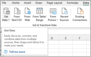
Fig 1 – Accessing the Get Data option of the Excel Ribbon
Clicking Get Data provides a long list of data sources that Microsoft Excel supports.
The AtScale data model appears as a SQL Server Analysis Services (SSAS) database to Microsoft Excel (i.e., the AtScale data model appears as an SSAS “cube” to Excel).
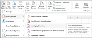
Fig 2 – Selecting Analysis Services as the data source
If you’re unfamiliar with SSAS, it is a technology uniquely suited to analyzing data with Microsoft Excel PivotTables – as you will see in the following subsection.
AtScale data models are hosted on your IT department’s computer servers. Connecting to AtScale servers is straightforward, as illustrated below.
Your IT department provides you with the server name, and security is typically handled via Microsoft Windows:
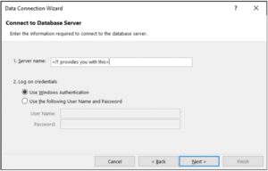
Fig 3 – Connecting to the AtScale server
Clicking the Next button connects Microsoft Excel to the AtScale server, where you can see the available collection of AtScale data models.
Your IT department will provide you with the information to connect to the AtScale data model you need to conduct your analyses.
In this case, the Internet Sales data model provides data for e-commerce transactions:
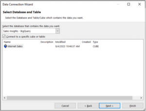
Fig 4 – Selecting the AtScale data model
Clicking the Finish button takes you to the last step in connecting Microsoft Excel to an AtScale data model – specifying how you want the data imported into Excel.
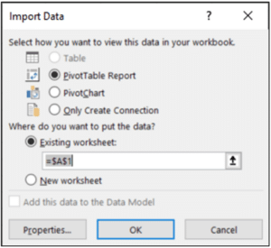
Fig 5 – Importing the AtScale data model
While the Import Data dialog supports several options, the PivotTable Report option is most commonly used.
Clicking the OK button completes the connection.
Note – The AtScale server provides the storage and processing of your analyses. Only the results are returned to Microsoft Excel running on your computer (e.g., your laptop). This design allows you to work with large data sources using PivotTables efficiently.
PivotTables and AtScale Data Models
Because AtScale data models appear as SSAS cubes in Microsoft Excel, your skills with analyzing data using PivotTables are 100% applicable – the PivotTable experience you know, and love is unchanged.
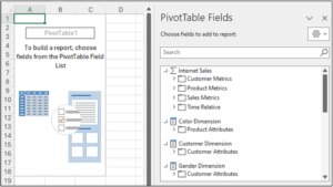
Fig 6 – An Excel PivotTable connected to an AtScale data model
Fig 06 depicts the power of AtScale data models. Taking a close look at the PivotTable Fields dialog:
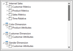
Fig 7 – The PivotTable Fields available in the AtScale data model
It’s possible that you’re not familiar with PivotTable fields represented as depicted in Fig 07. For many Excel users, PivotTables look like the following:
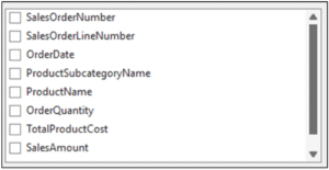
Fig 8 – Typical PivotTable fields
The difference between Fig 7 and Fig 8 is that AtScale data models provide you with defined “measures” and “dimensions.”
AtScale Measures and Dimensions
The Internet Sales data model depicted in Fig 07 provides a collection of measures and dimensions for you to use in your analysis. Before diving into specific measures and dimensions, it’s best to define the terms:
- A measure is a quantitative value (i.e., a number) that records the results of a business process. Examples of measures include sales, expenses, and order counts. Measures are the numbers that appear in Excel PivotTables.
- A dimension is categorical data that describes measures. Examples of dimensions include customers, products, and dates. Dimensions are the text values that appear as row and column labels in Excel PivotTables
The Internet Sales data model provides many measures organized into groups based on various subject areas (e.g., Sales). Clicking on the Sales Metrics folder lists the measures available:
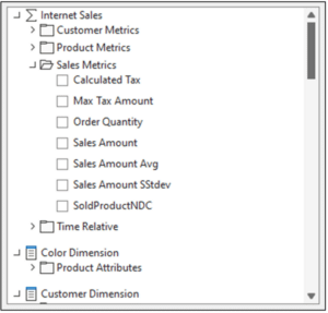
Fig 9 – The Sales Metrics measures of the Internet Sales data model
Measures like Order Quantity, Sales Amount, and Sales Amount Avg can be dragged to the Values section of your PivotTables:
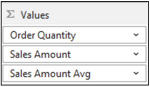
Fig 10 – Adding measures to a PivotTable
Similarly, the various dimensions of the Internet Sales data model are available for slicing, dicing, and drilling down on the measures:
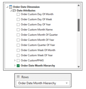
Fig 11 – Adding the Order Data Month Hierarchy to a PivotTable
You can think of the measures and dimensions of the Internet Sales data model as building blocks to use in your data analyses. These data building blocks are standardized and provide clean data from a trusted enterprise source.
Using AtScale data models frees you from the drudgery of acquiring and cleaning data and allows you to focus on producing business insights.
Getting Grounded in the Data
As you’re new to the organization, the first step in your analysis is to get grounded in the data.
Visualizing e-commerce Sales
First up, creating a pivot of e-commerce sales over time. This is a simple PivotTable consisting of one measure and one dimension:
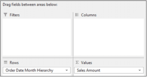
Fig 12 – The first pivot of the Internet Sales data model
Here’s the PivotTable in the worksheet:
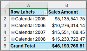
Fig 13 – The first PivotTable
The PivotTable uses the Order Data Month Hierarchy, set by default to aggregate data at the year level. The pivot table clearly shows that there has been tremendous growth in e-commerce sales (e.g., sales doubled from 2005 to 2006).
However, looking at the data at this high grain doesn’t allow for understanding any patterns (e.g., trends) in the data. Looking at the sales data at a lower grain (e.g., at the monthly level) might produce better insights.
This is easily accomplished by selecting all the date cells, right-clicking with your mouse, and then selecting Expand/Collapse > Expand to “Order Month”:
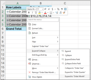
Fig 14 – Expanding the date hierarchy to the monthly grain
And here’s the expanded PivotTable:
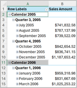
Fig 15 – The expanded PivotTable
Even with the table expanded, determining any patterns in sales over time is difficult. The easiest way to see what’s going on is to use a line chart. Excel PivotCharts make this very easy:
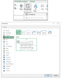
Fig 16 – Inserting a line PivotChart
The resulting line chart provides a much clearer understanding of e-commerce sales over time:
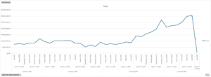
Fig 17 – Monthly e-commerce sales
Fig 17 clearly shows that while there is some variation in monthly e-commerce sales, the main pattern is a strong upward trend starting in July 2007.
Visualizing Average Order Value (AOV)
As the Director is under pressure regarding the decline in the AOV KPI, the next step is to get grounded in the historical patterns of AOV.
Visualizing AOV over time is simply a matter of swapping out the measure used in the PivotTable:
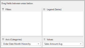
Fig 18 – Changing the measure to visualize AOV over time
The PivotChart automatically updates to reflect the new measure:
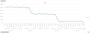
Fig 19 – Monthly AOV over time
Fig 19 clearly shows that there has been a dramatic decline in AOV during the same time that overall e-commerce sales have gone up.
Interestingly, AOV had a big drop around the same time that overall e-commerce sales spiked – July 2007.
Refreshing the Data
In addition to providing clean and integrated data for your analyses, the AtScale data model gives you another productivity boost – data refreshes.
As time progresses, new sales data will be automatically available via the data model. By connecting your PivotTables to the data model, you can access the latest data by using a simple PivotTable refresh.
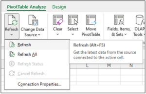
Fig 20 – Refreshing PivotTable Data from the AtScale Data Model
Here’s a prime reason to prefer using PivotCharts in your analyses. Whenever you refresh your PivotTables, the associated PivotCharts are updated automatically!
What’s Next?
With the high-level grounding in the data, the next step is to dig further into what’s been happening with e-commerce sales over time.
Once again, the intersection of the AtScale data model, PivotTables, and PivotCharts will be critical in quickly producing new insights.
Until next time, stay healthy and happy data sleuthing!
Power BI/Fabric Benchmarks