
Additional contribution by: Santanu Chatterjee, Trystan Leftwich, Bryan Naden.

In the previous post, we discussed typical use cases for percentiles and the advantages of percentile estimates. In this post, we illustrate how to model percentile estimates with AtScale and use them from Tableau.
To learn how to be a data driven orgazation, check out this webinar!
Join Jen Underwood to Learn Best Practices on Deploying Data Analytics Strategy
How to Model Percentiles
Using AtScale’s SalesInsights cube, let’s create a percentile aggregation to analyze Sales Order records, then create a Tableau dashboard to visualize the data. For this example we’ll use the Sales Order fact table. Figure 1 shows the definition of the “factinternetsalesorder” dataset, which stores the order records for our fictitious online store. It has foreign keys to the “Order”, “Customer”, “Ship Date” dimensions and a “salesamount” column containing the amount of each sale.
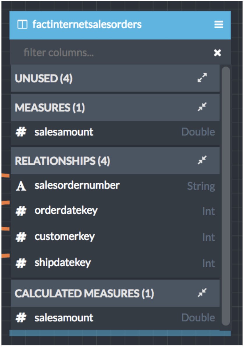
Figure 1. The “factinternetsalesorder” dataset
We’re interested in knowing the distribution of order sales amount (i.e., the “salesamount” measure) across different dimensions. A good way to quickly get a feel for the distribution of a dataset is to look at its mean, median (50th percentile) and interquartile range range (25th and 75th percentiles) .
In AtScale’s Design Center, creating a percentile measure for the sales amount column is done by dragging the salesamount column to the measure panel to pop up the measure creation dialog (See Figure 2). We want to see the quartiles of our data, specifically what sales amounts demarcate the 25th, 50th, and 75th percentiles. Simply choose the “Percentile” aggregation type, then specify an accuracy level (higher accuracy requires more computational resources), and choose the desired percentile configuration. AtScale ships with the following predefined Percentile configurations: Median, Quartiles, Deciles, and Custom. For this example we’ll choose the “Quartile” option to find the 25th, 50th, and 75th percentiles.
The “Custom” option allows you to specify your own percentile thresholds, for example you can easily configure the 1st and 99th percentile thresholds by consecutively entering “1” and “99”. The data is sorted in ascending order so you can think of the 1st percentile as containing the records with the smallest values in your dataset and the 99th percentile as containing the records with the largest values. Note, there is no rule that you have to specify percentiles in pairs.
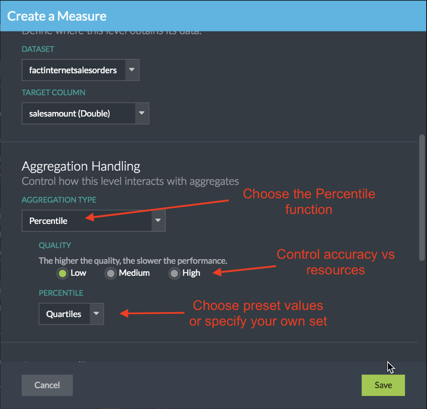
Figure 2. Configure a Percentile Aggregation Function
The “Quality” setting configures the tradeoff between the estimate accuracy and cluster resources. What value should you choose? It depends on the size and shape of your data as well as your accuracy requirements. Higher values drive more accurate estimates by creating more precise histograms at the cost of greater query run times, cluster memory and network usage. Later, we’ll discuss how these settings affect accuracy and scaling of the algorithm on the tpc-ds benchmark dataset.
Should you believe everything you read in analysts reports? Join us as we cut through analyst jargon and reports.
Register Now
How to Use Percentiles in Tableau
The first thing we notice when viewing the cube in any supported BI tool (Figure 3) is that the cube’s percentile measure configuration expands to one usable measure for each percentile threshold. Since we chose “Quartiles” we now see four quartile measures, each with the “PCTL-25” through “PCTL100” suffix corresponding to the 25th, 50th, 75th, and 100th percentile thresholds. If we had chosen “Deciles” AtScale would have generated ten measures for us.
In Tableau dragging the measures to the desired shelf will retrieve the percentile threshold estimates for the underlying column scoped by the product of the group-by column members. In Figure 3 we’ve put Customer Country on the rows shelf, grouping the results by country. AtScale will return a set of percentile estimates for each country, however only one row is returned in this case because we are filtering by Country = “United States”.
Displaying Percentile Thresholds
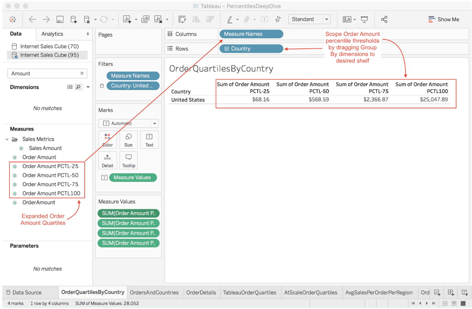
Figure 3. Displaying Percentile Thresholds in TableauFigure
Displaying a Quartile Label for each Order
Let’s say we want to add a visualization that displays the quartile for each order amount. We can create a Tableau formula to compare the order amount to each percentile threshold and return a user-friendly label. However this approach is problematic because AtScale computes the percentiles scoped by the group-by dimension members. In this case we want to group by Order ID, which returns exactly one row for each distinct Order ID. What are the 25th, 50th and 75th percentile thresholds of a set consisting of one element? This is a nonsensical question because there is only one element in the set.
To get around this problem we have to group the order data at a higher level, like country and state, or maybe just country. Luckily, Tableau’s level-of-detail (LOD) expressions allow us to change the scope of data aggregation for a formula. When combined with AtScale’s percentile estimation capability we have a viable way to analyze all data in the data lake!
We could use Tableau’s FIXED directive to scope our percentile calculation to the State level, but we may want to compute percentiles at some other level of a different hierarchy. To reduce the number of customized formulas, we use Tableau’s EXCLUDE directive to remove the Order level from the calculation’s group-by clause. This single expression can be used in multiple visualizations. We create a formula for each of our four quartile measures. Figure 4 shows our expression for the 25th percentile. Note that the MAX() aggregation function is required for Tableau’s expression engine; however it is ignored by AtScale because the aggregation function is part of the measure’s definition in the cube. In this case AtScale uses the cube-defined PCTL-25 (25th percentile) aggregation operation.
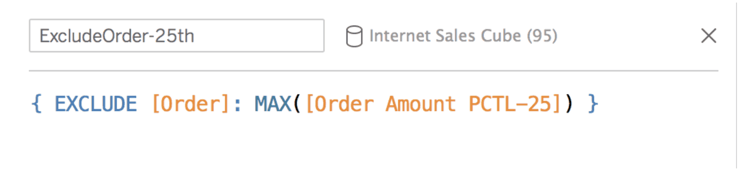
Figure 4. Changing scope of percentile calculation.
Now that we have a way to create a visualization that shows Order IDs and the amount’s quartile at the State level, we want to display a user-friendly label. For example, in California an order amount of $3.40 falls into the 0-25th percentile, so we want to display a label like “0-25th”. Figure 5 shows the formula for such a label. The OrderQuartile formula displays the appropriate quartile label if the [Order Amount] measure is less than or equal to the quartile threshold, “[ExcludeOrder-xxth]”, else “NA”.
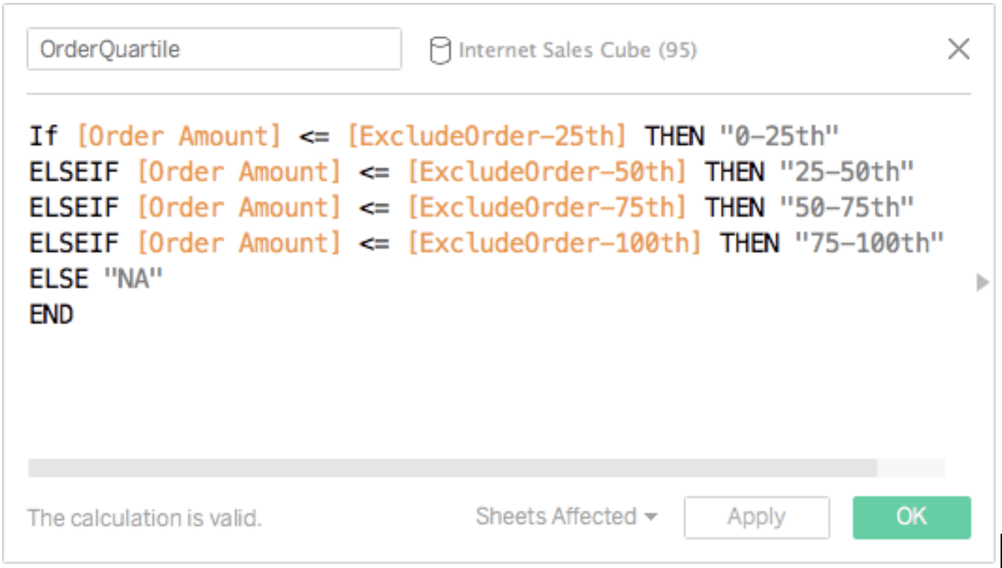
Figure 5. Order Quartile Label Formula
Using the “OrderQuartile” formula in a visualization that groups by Country and Order produces output displayed in Figure 6. This is a great visualization to show when our dashboard user wants to drill down into the Order level of detail because it provides relative context for each order.
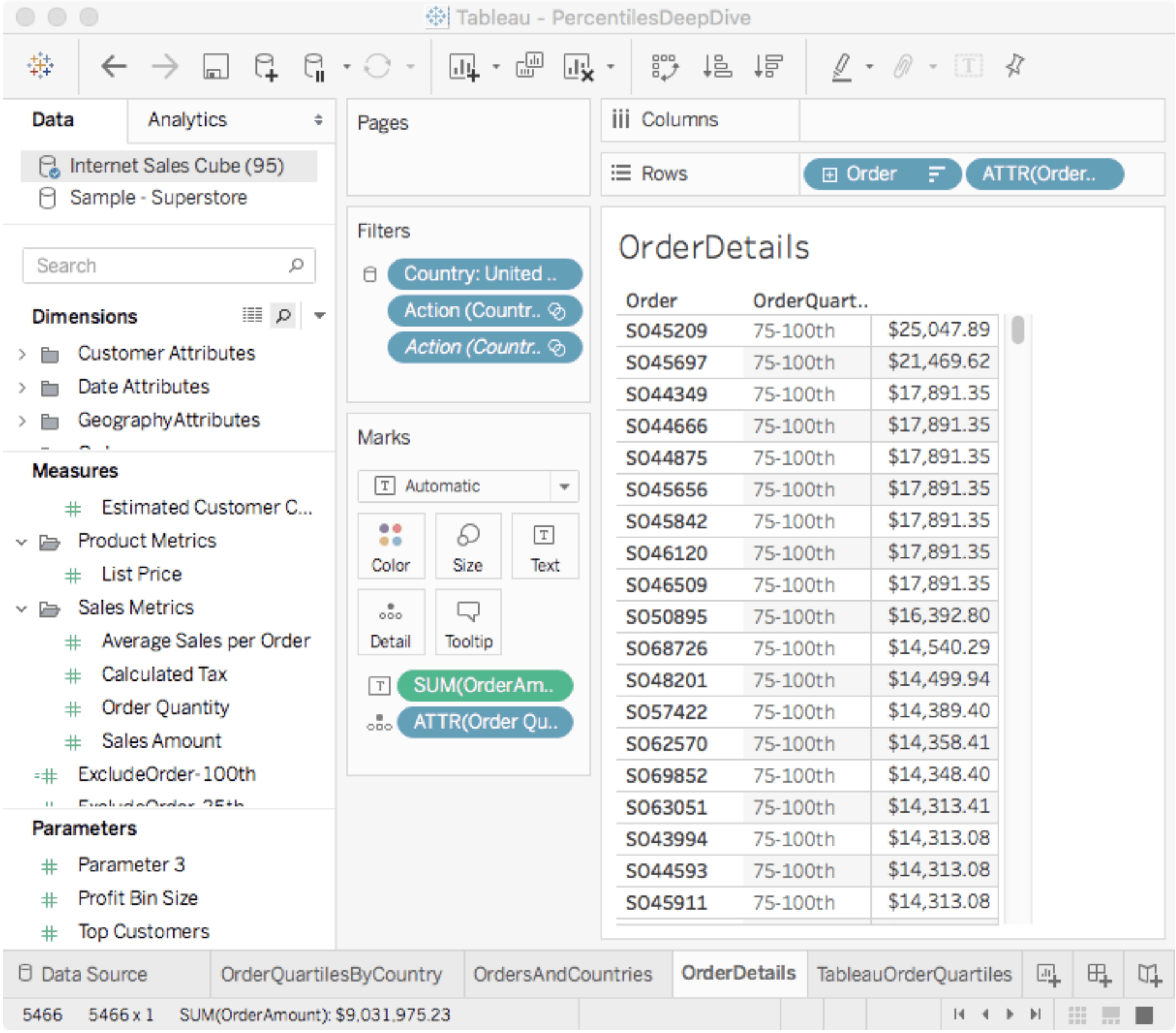
Figure 6. Using an LOD Expression to Combine Higher-level Percentile Calculations with Order-level Detail
Displaying Quartile Bands Using Tableau Reference Lines
When viewing the mean Order amount for each Country and State we really don’t have enough context to understand the if the mean order is a an accurate representation of the data for a given country and state. Is the mean being thrown off by a small number of large or small orders? To answer this question quickly with a visualization we can use AtScale’s median (aka. 50th percentile) and interquartile range estimates.
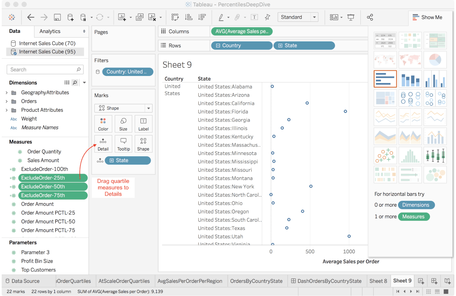
Figure 7. Using an LOD Expression to Combine Higher-level Percentile Calculations with Order-level Detail
We start by grouping the Average Sales Per Order measure by Country and State (Figure 7) and then perform the following steps:
- Add Quartile Thresholds to Details:a. Drag the LOD expressions to the “Details” mark card: ExcludeOrder-25th, ExcludeOrder-50th, ExcludeOrder-75th. (Figure 7).
- Add Quartile Bands:a. Right click numeric access, select “Add Reference Line”.b. Choose “Band” to create a band of solid color to add context (Figure 7).c. Choose Scope option “Per Cell” to compute the bands for the product of the group by dimension members. For example Grouping By Country (n=1, USA) and State (n=50, USA States) = 50 quartile bands.d. For “Band From”, choose the “Sum(ExcludeOrder-25th)” formula measure to represent the 25th percentile boundary. Remember that AtScale ignores Tableau’s “Sum” aggregation function because the measure “[Order Amount PCTL-25]” has its own aggregation definition in the cube (i.e “Quartile). Because you chose “Per Cell”, AtScale returns one row for each group by cell, making the client-side aggregation operation a no-op. If you choose “Per pane” or “Entire Table” Tableau will perform the Band configuration’s aggregation function across all cells in the larger scope. For example, choosing “min” and a scope of “entire table” will create one band with the min value from all country state “[Order Amount PCTL-25]” results.e. For “Band To” choose “Sum(ExcludeOrder-75th)” to specify the upper boundary of the band.
- Add Median Line:a. Repeat the previous instructions for adding quartile bands but choose “Line” instead of band and choose the “SUM(Exclude-50th)” measure.
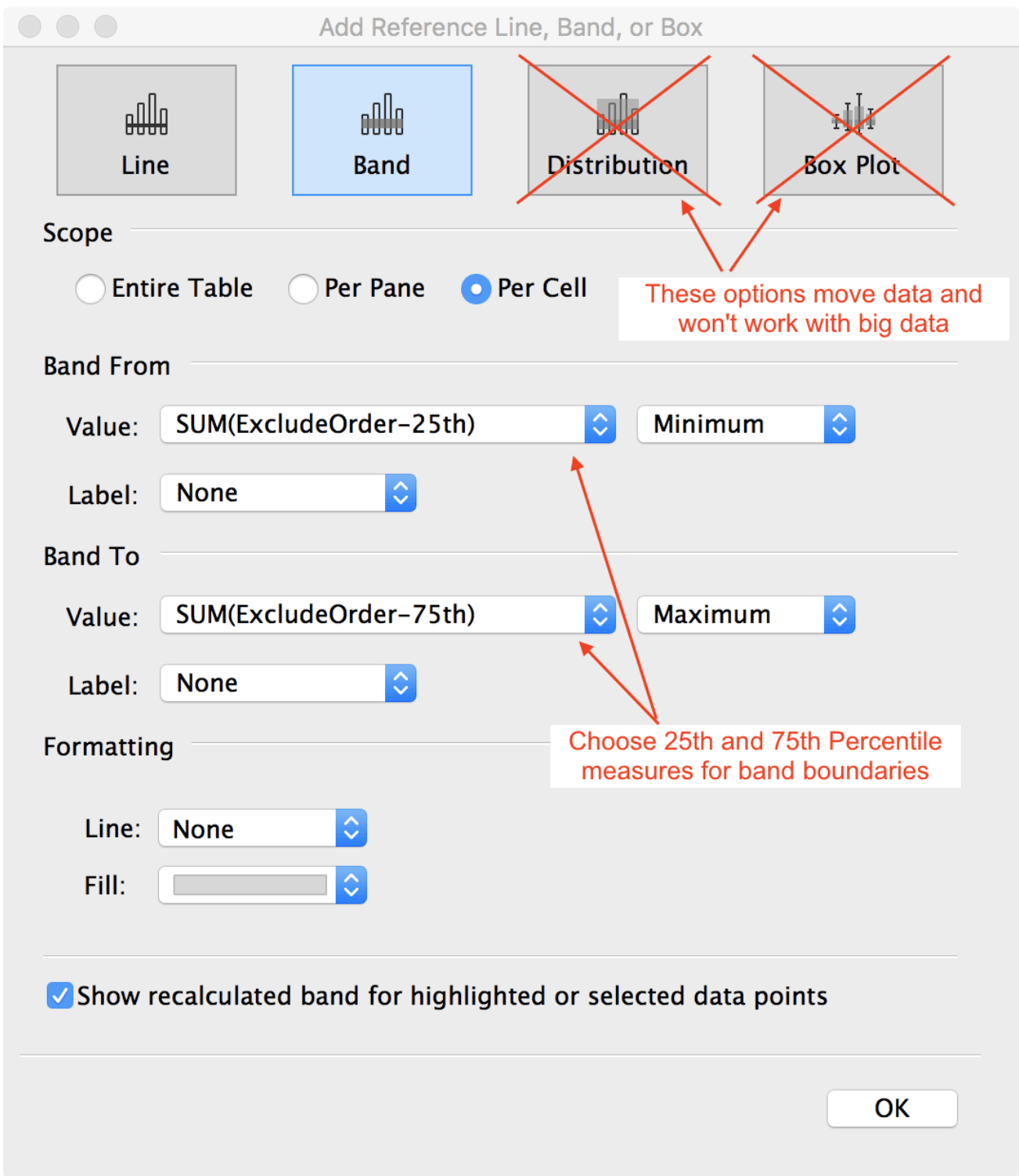
Figure 8. Connecting Tableau’s Reference Bands to AtScale’s Percentile Measures
When creating reference lines you should not choose Tableau’s “Distribution” or “Box Plot” options because Tableau requires access to the raw data to make these calculations. This simply will not work when connecting Tableau directly to a multi-billion row data source. __This is exactly why AtScale was invented! __
Figure 9 shows the updated visualization with gray bands to visualize the distance between the 25th and 75th percentile for each state. A dark gray vertical bar identifies the dataset’s median. By comparing the median to the mean (color circle) we may see if the data is skewed. Observing the width of the gray band gives us a sense of the data’s spread that is resistant to outliers, unlike the standard deviation. For example, I can see that the mean lies a good deal to the right of the median for Washington and Oregon. Our sales in those states are positively skewed by a small number of large orders, so we shouldn’t place too much meaning on the mean sales statistic. Utah has both positively skewed data and a larger distance between the 25th and 75th percentiles than the other states. Clearly Utah’s data should be investigated further before we decide to open a brick-and-mortar store in that state.
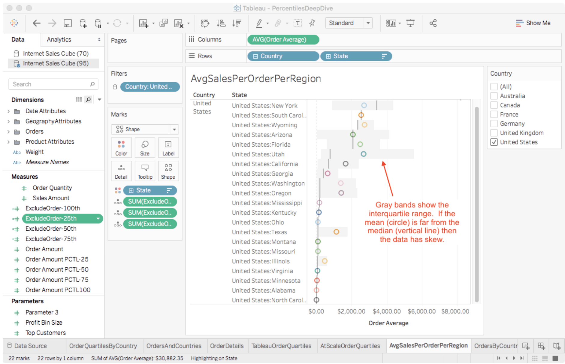
Figure 9. Mean Order Amount Grouped by Country, State with Median, and Interquartile Range
Wonder how you can increase adoption of data analytcs in your organization? Join us for a deep dive into BI on the data lake.
Register Now
Combining the Visualizations
Combining the visualizations into a dashboard delivers users a true sense of central tendency, data range, skew, and even order-level classification in a compact space (Figure 10). This is wonderful because I’ve analyzed my entire order table without moving data from its original location or having to compromise by analyzing a smaller subset of data via an extract. So how accurate are the results and what kind of load does it place on my cluster?
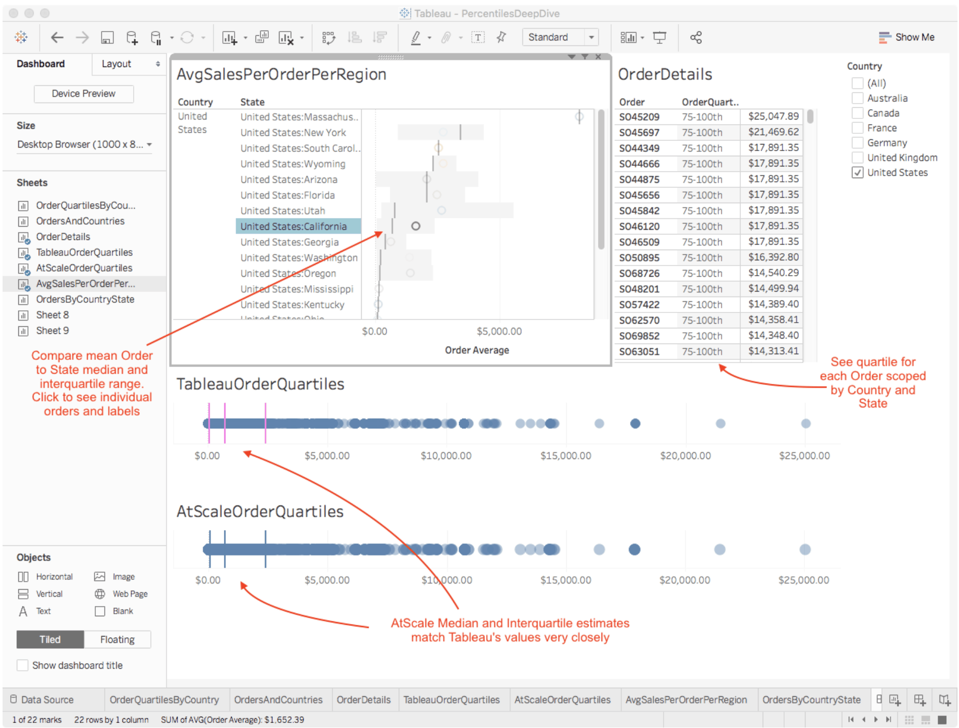
Figure 10. Order Dashboard with Country, State Median Interquartile Range and Order Labels
In this post we demonstrated how to model percentile estimates in AtScale and visualize the results in Tableau. In the next and final post, we share accuracy and scaling metrics of the AtScale algorithm on 8.3 billion rows of data. If you missed part I of this series, here is the link. Stay tuned to learn more!
SHARE
Case Study: Vodafone Portugal Modernizes Data Analytics