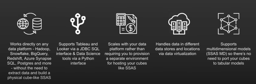
AtScale connects to data where it lies. Whether it’s stored in a data lake like Hadoop or a cloud data warehouse like Snowflake, the data stays where it is. There is no pre-compute, data aggregation, or extracts, which means you get full access to the full fidelity in your data warehouse.
We support not only MDX and DAX queries but also SQL to support tools like Tableau and Looker. This is a cloud-based, lightweight service line that has a live connection to your data, which will scale your data without SSAS cube data storage or memory to maintain.
The Problem With SSAS and SSAS Cubes
SQL Server Analysis Services (SSAS) is a data mining tool that helps make sense of data in disparate places across an organization. It organizes and contextualizes this data with SSAS cubes.
SSAS cubes have been helpful in processing information from disparate databases in the past. However, they’re not very user-friendly and make democratizing data pretty difficult. The big problem with SSAS cubes is that they’re difficult to manage. A large part of that is because SSAS in and of itself is inaccessible to average users as it requires a basic knowledge of query languages.
That inflexibility with democratization is a huge problem in modern business. With data-driven decisions more important than ever, each and every department must be able to conduct its own data analysis. That’s really hard to do with SSAS in the picture.
Here’s the good news, you don’t have to deal with SSAS altogether. With a semantic layer, you can harness the “power” of a “cube” with ease, flexibility, and accessibility.
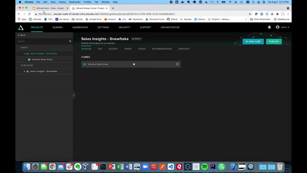
AtScale “Cube” Creation Walkthrough
Let’s start this demo off by creating our own virtual cube within the AtScale Design Center. To do this you can click “New Cube” in the top right corner, and give it a cube name as seen below. This will then take you to the canvas which will be used to build out your AtScale model.
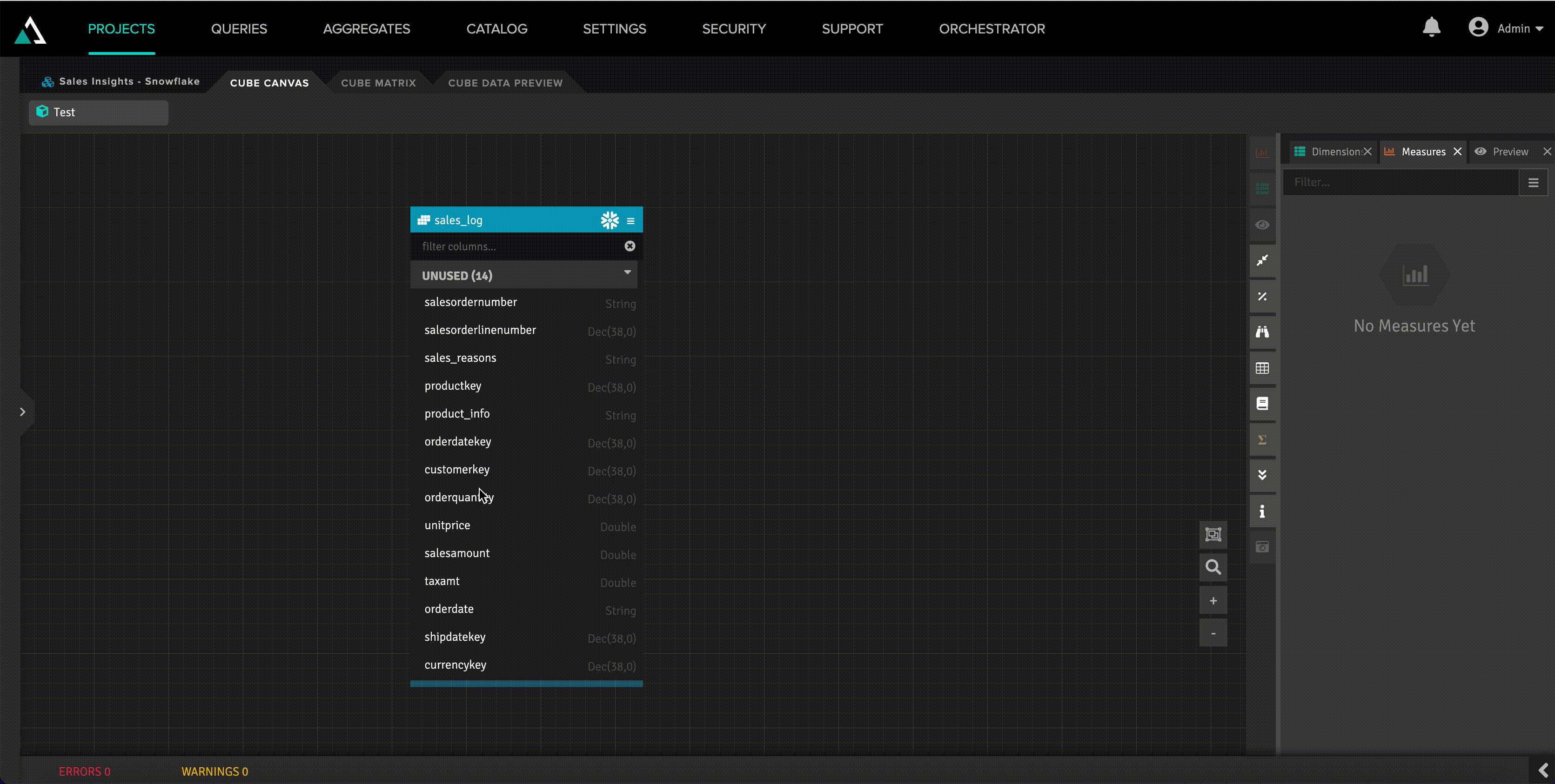
Below also shows the canvas where we can connect to different data sources using the Data Sources pane. In the example below, we will be using Snowflake.
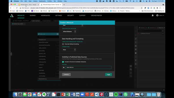
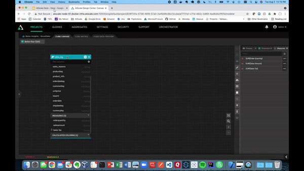
Building our model is as easy as dragging tables into the canvas. Next, you can define tables as dimensions and facts. The video below shows examples of what it looks like to turn sales amount and sales quantity into measures, which can be saved in a folder. AtScale will handle the default aggregation method as a SUM for the sales data.
Now that we have a couple of metrics, we can create a calculated column. We can also augment the fact table with data already present using that calculated column. This is useful for those situations in which changing the underlying data or structure will take up too much time and resources.
For example, if we want to create a calculated column called “Sales Tax,” just click the hamburger button at the top right of the table. Then, click on the “Calculated Column.”
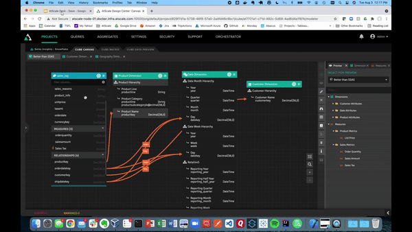
Below, we’ll demonstrate how using the library pane allows you to store dimensions as conformed dimensions and share them across models within the same project. These dimensions can be dragged onto the canvas. Unlike with SSAS and SSAS cubes, we can create relationships just by hooking them up to our fact tables.
You may have nested product information fields in modern data warehouses like Snowflake. With AtScale, you can create mapped columns with color and style keys. These can get turned into dimensions. This allows BI users to filter or slice within their business intelligence tool.
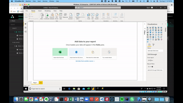
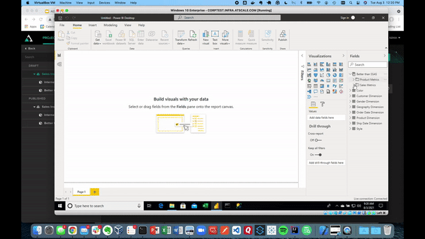
Once that’s finished, we can publish our AtScale model. This allows us to connect to our various BI tools, like Power BI, as well as ML tools. Here, we have Power BI using a live connection to our data.
After creating this connection, our model performs excellently. Power BI will inherit the full model by communicating through DAX queries where you can see all of the dimensions without having to remodel.
AtScale will automatically generate the right SQL queries against our Snowflake data warehouse at BI speeds. Below shows the same connection visualizing our sales data.
This data visualization can be done in Tableau, Excel, Looker, and any AI or ML tool. Each tool can use the same semantic layer and create consistency across your business. Anyone in the organization can see the data (whether it’s key insights, ML features, or any kind of manipulated data) and use it for their data science projects.
Say goodbye to SSAS and SSAS cubes. Use the power of the semantic layer.
Got your interest? We’re happy to share more about how AtScale can take your organization’s data strategy to the next level. See AtScale in action and request a demo today.
SHARE
2026 State of the Semantic Layer