Dave Langer founded Dave on Data, where he delivers training designed for any professional to develop data analysis skills. Over the years, Dave has trained thousands of professionals. Previously, Dave delivered insights that drove business strategy at Schedulicity, Data Science Dojo, and Microsoft. Follow Dave on LinkedIn.
Empowering Excel Analysts
Welcome to the fourth in a series of blog posts showing how AtScale empowers Microsoft Excel users to conduct powerful data analyses.
This blog series is specifically designed for professionals who use Excel. As such, the following principles will guide this blog series:
- The primary focus will be analyzing data using Excel PivotTables.
- Technical details not related to Microsoft Excel will be kept to a minimum.
- Helping Excel PivotTable users learn new features to assist with data analysis.
Throughout this blog series, I will use the term “Excel Analyst” to refer to any professional who analyzes data using Excel PivotTables.
In my experience, the population of Excel Analysts is easily 100+ million professionals worldwide. The goal of this blog series is to help as many of these professionals as possible to achieve more. In this analysis, I use the AtScale Semantic Layer Platform to connect my Excel PivotTables to live cloud data to do high-performing, real-time analysis without any data extraction. Read on to learn how to use Excel PivotTables to perform categorical analysis with real-time data without any data extraction.
The Scenario So Far
For a complete description of the hypothetical scenario used in this blog series and for some data background, check out the Part 1 blog post.
In Part 2 of the series, you began analyzing the Average Order Value (AOV) key performance indicator (KPI) over the past few years.
Part 3 of the series analyzes how the typical amount of Internet sales has changed over the years.
At this point, you’re not ready to report any findings to the Director of e-commerce (your boss’s boss).
The next step in the analysis is to slice and dice the data for further insights using the dimensions (i.e., categorical data) provided by the AtScale data model built by the IT department.
Configuring the PivotTable
Using an AtScale data model makes rapidly analyzing data very straightforward because the data model guides configuring your PivotTables:
- Dimensions are used for the rows, columns, and filters of your PivotTables.
- Measures are used for the values of your PivotTables.
This blog post will illustrate rapidly analyzing Internet sales data by changing the dimensions and measures used.
Adding Dimensions
As covered in previous blog posts in this series, the performance of Internet sales has changed substantially over the years.
One insight was that introducing two new product lines appears to be associated with a rapid rise in total Internet sales and a rapid decrease in the average order value (AOV) key performance indicator (KPI).
Both time and product lines are dimensions in the AtScale data model so that the first analysis will use a combination of these dimensions.
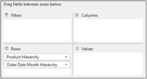
Fig 01 – Adding the Dimensions to the PivotTable
As will be shown later in this blog post, this PivotTable configuration will be beneficial for analyzing Internet sales over time by interacting with various categories.
Adding a Measure
As there is a direct association between the volume of Internet orders and total revenue, a logical first measure to analyze is order quantities.
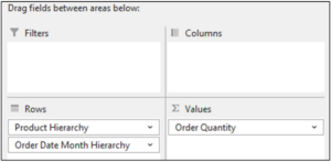
Fig 02 – Adding the Measure to the PivotTable
The PivotTable now looks like the following.
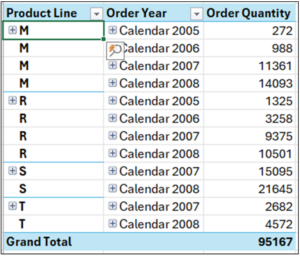
Fig 03 – The PivotTable Data
From a previous analysis, you’ve learned that the Product Line categories are mapped as follows:
- M – All products related to mountain bicycles (e.g., complete bikes, parts, accessories, etc.).
- R – All products related to road bicycles.
- S – Miscellaneous products unrelated to bicycles (e.g., gloves and shirts).
- T – All products related to touring bicycles.
With the PivotTable configured, it’s time to build the PivotChart to analyze the data visually.
The First PivotChart
Examining PivotTables directly is the norm for many Excel users. However, visualizing the data is a far more efficient way to analyze data – especially if the goal is to identify trends and patterns.
Enter the power of Excel PivotCharts.
Inserting the Chart
Microsoft Excel makes it straightforward to add a PivotChart to a worksheet:
- Select the Insert option of the Excel Ribbon.
- Within the Charts section, click PivotChart.

Fig 04 – Inserting a PivotChart
Following the above steps opens the Insert Chart dialog. Excel will analyze the structure of the Pivot Table and suggest a PivotChart that it thinks is appropriate.
In this case, Excel correctly suggests a Clustered Column chart.
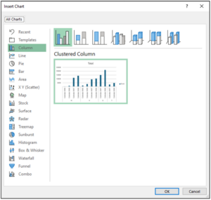
Fig 05 – The Insert Chart Dialog
Clicking the OK button inserts the PivotChart into the worksheet.
Configuring the PivotChart
Unfortunately, Microsoft Excel charts are rendered with distracting visual aspects that impede visual data analysis (known as “chartjunk”).
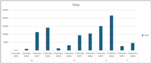
Fig 06 – The Default PivotChart
Cleaning up Excel charts is almost always a good idea, and Fig 06 is no exception.
By configuring the PivotChart to eliminate chartjunk, you achieve two goals:
- You arrive at a visualization suitable for analysis.
- You arrive at a visualization suitable for presentation to stakeholders.
The first step in the configuration is to remove the gridlines.
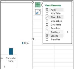
Fig 07 – Removing the Gridlines
Here are the steps for removing the gridlines:
- With the PivotChart selected, click on the green plus symbol at the top right of the chart.
- From the Chart Elements menu, uncheck the Gridlines option.
The next step is adding data labels to the PivotChart.
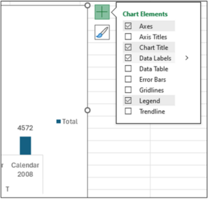
Fig 08 – Adding Data Labels to the PivotChart
With the Chart Elements menu open, check the Data Labels option.
With data labels added to the PivotChart, the y-axis is no longer needed.
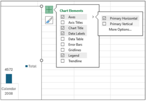
Fig 09 – Removing the Y-axis from the PivotChart
Here are the steps for removing the y-axis:
- With the Chart Elements menu open, click the arrow to the right Axes.
- From the fly-out menu, uncheck Primary Vertical.
The above alters the PivotChart to look the following.
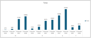
Fig 10 – The Cleaned-up PivotChart
Note: Keeping the title at the top of the PivotChart can be handy if you plan to present the visualization. When doing this, be sure to change the title to reflect the key insight of the chart before presenting.
Expanding the PivotChart
While the PivotChart of Fig 10 is highly informative, a quick expansion of the chart by adding the Sales Amount Avg measure provides additional insight.
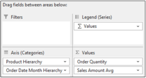
Fig 11 – Adding the Sales Amount Avg Measure
Excel automatically updates the PivotChart to reflect the change in the PivotTable.

Fig 12 – The Updated PivotChart
Note: The PivotChart depicted in Fig 12 has the title removed.
Analyzing the PivotChart
The PivotChart depicted in Fig 12 provides many insights:
- Internet sales related to mountain bikes (i.e., product line M) dramatically increased as measured by Order Quantity. Simultaneously, the Sales Amount Avg KPI decreased dramatically.
- Internet sales related to road bikes (i.e., product line R) followed the same pattern as mountain bike Internet sales.
- Internet sales related to miscellaneous products (i.e., product line S) were introduced in 2007 and are very high as measured by Order Quantity. However, the Sales Amount Avg KPI is very low at approximately $41.
- Internet sales related to touring bikes (i.e., product line T) were introduced in 2007 and have grown dramatically year-over-year as measured by Order Quantity. Unlike mountain and road bikes, touring bikes have demonstrated an increase in the Sales Amount Avg KPI.
Note: The above insights were also covered using line charts in Part 1 of this blog series. The above demonstrates that Excel column charts can also be used to analyze data over time.
Drilling Into the Data
A powerful feature of Column PivotCharts is how easy it is to drill into the data. Drilling into the data is essential in understanding the “why” of what’s happening.
Drilling Into Mountain Bikes
The first step in understanding the “why” is to drill into each product line. The hierarchies of the AtScale data model dimensions make this easy.
The first step is to apply a filter on Product Line to select just mountain bikes.
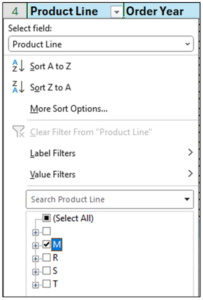
Fig 13 – Filtering the PivotTable to Mountain Bikes
The next step is to expand the Product Line to the level of Product Category.
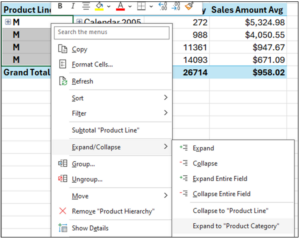
Fig 14 – Expanding the PivotTable to Product Category
Here are the steps for expanding the PivotTable:
- With all the Product Line cells selected in the PivotTable, right-click using your mouse.
- From the menu, hover over the Expand/Collapse option.
- From the fly-out menu, click Expand to “Product Category” with your mouse.
Microsoft Excel updates the PivotChart in response to the changes in the PivotTable.
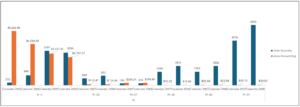
Fig 15 – The Mountain Bikes PivotChart
Expanding the Product Categories in the PivotTable shows the following mappings of categories to products:
- M-1 corresponds to mountain bicycles.
- M-22 corresponds to “Women’s Mountain Shorts.”
- M-27 corresponds to “All-Purpose Bike Stand.”
- M-28 corresponds to “Mountain Bottle Cage.”
- M-30 corresponds to “Fender Set – Mountain.”
- M-37 corresponds to mountain bike tires and tubes.
Fig 15 provides a lot of “why” regarding the Internet sales of mountain bikes:
- It appears that the decreases in mountain bike (i.e., category M-1) prices may be associated with increasing sales as measured by Sales Amount Avg and Order Quantity.
- Miscellaneous mountain bike products (e.g., bottle cages) were introduced in 2007.
- Despite decreased prices, mountain bikes represent most product line sales.
- However, the sales of low-cost items represent the bulk of Order Quantity by 2008.
Drilling Into Touring Bikes
Changing the filter on the PivotTable to only display touring bikes (i.e., Product Line T) updates the PivotChart.
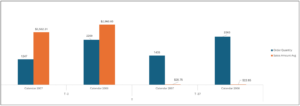
Fig 16 – The Touring Bikes PivotChart
Expanding the Product Categories in the PivotTable shows the following mappings of categories to products:
- T-4 corresponds to touring bicycles.
- T-37 corresponds to touring bike tires and tubes.
Fig 16 provides a lot of “why” regarding the Internet sales of mountain bikes:
- Unlike mountain bikes, the Internet sales of touring bikes are roughly split between high-priced bicycles and low-priced miscellaneous products.
- Also, touring bikes are not being marketed with promotions/discounts given the year-over-year increase in Sales Amount Avg.
Drilling Into Road Bikes and Miscellaneous Products
This post will not show drilling into the road bikes and miscellaneous product lines for brevity. Instead, the following summarizes the insights found:
- Road bikes show the same patterns over time as mountain bikes.
- For the miscellaneous product line, high growth as measured by Order Quantity is seen across all product categories.
- However, the Sales Amount Avg for most categories is very low.
What’s Next?
Drilling into the data has provided a lot of “why” regarding what’s been happening with Internet sales.
Using Column PivotCharts has allowed for investigating the sales patterns for each product line over time.
In the next blog post of the series, you will use the AtScale data model to create Internet sales forecasts and suggest business changes resulting from your analyses.
Until next time, stay healthy and happy data sleuthing!


SHARE
2026 State of the Semantic Layer