Life for humanity across the globe has changed for the foreseeable future. The COVID-19 pandemic has had a massive impact on every aspect of our lives from work to childcare to enjoying local businesses and restaurants in our communities. As we work through the initial wave of the COVID-19 pandemic, we at AtScale are making data, analysis-ready to answer the question: “Where are we on the path back to “normal?” This post is the first in a series that will leverage data to understand the evolution of how we adapt to live our lives during a global pandemic.
This week we are investigating what the data says about how folks are beginning to interact with their communities again. In this article, we’ll explore relevant health, business, and mobility data points collected across a multitude of publicly available sources.
For those interested in understanding how we make the data available, our data team leveraged AtScale’s Intelligent Data Virtualization™ platform to build a dynamic Cloud OLAP model on top of Snowflake’s and Google BigQuery’s cloud data warehouse. The model’s semantic layer is publicly published and leveraged by a team of business analysts who used Tableau to explore the data and produce insights into behavioral trends across the United States. You can access this Tableau workbook yourself by clicking here.
The data that we are using in today’s post includes:
- Google’s Mobility Data
- TSA checkpoint travel numbers
- Open Table State of the Industry
- New York Times COVID-19 Data
Now, let’s dig into the data!
How people are moving around their communities
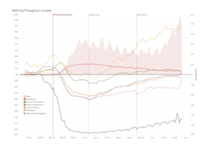
On March 11th, the WHO officially declared COVID-19 a pandemic. At this point, the United States had 245 confirmed cases and most of the country was beginning to emerge from winter. Over the next few weeks, as the number of confirmed COVID cases started to increase exponentially and state and local governments started to impose restrictions, we began to notice some drastic changes in the mobility trends across Google’s place categories.

The Google Mobility Report, which highlights the percent change in visits to places like grocery stores and parks within a given geographic area against a mid-winter baseline, paints a picture of how behavior changed in response to the COVID-19 pandemic. Visits to grocery stores and pharmacies spiked in mid-March, as people scrambled to stock up on non-perishable groceries and essential supplies, before falling to lower levels than observed mid-winter.
Visits to retail and recreational locations, transit stations, and workplaces declined even further, as citizens exercised caution and states implemented closures of non-essential businesses. Bottoming out around Easter, the number of visits to these locations has started to tick back up, even as the number of new cases has spiked in recent weeks.
The trend for park visits is interesting as well. Although there was a sharp decline at the start of the pandemic, the increase in park visits has meaningfully outpaced the other location categories. Driving this increase is likely the warmer spring weather, the presumption of a lower transmission risk outdoors, and nationwide demonstrations against racism.
The impact on air travel
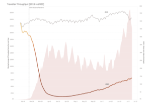
As indicated by the year over year TSA Traveler Throughput comparison above, the airline industry has been hit particularly hard by changes in behavior stemming from the COVID-19 pandemic.

Comparing the TSA traveler throughput at US airports gives a visual representation of how severe the behavioral changes have hit the industry. While non-essential businesses are reopening across the country, non-essential business activity, such as in-person meetings and conferences are still on hold.
Additional disruptions, such as rescheduled sporting events, cancelled music festivals, and fewer recreational opportunities have weakened the demand for personal travel. Those wary of contracting coronavirus are also seeking alternative travel options when available. Despite the fact that traveler throughput is roughly ~70% lower than comparable dates in 2019, almost 7x as many people passed through TSA on July 6th than passed through on April 6th. A trend certainly worth keeping an eye on.
While nationwide trends are interesting, the AtScale model allows us to drill down to finer grain detail and focus on the states hit the hardest by the first wave of the pandemic. Insight from these trends could even help anticipate how activity will change in states that mostly avoided an outbreak in April or May but may need to deal with a second wave of infections.
The impact on the restaurant industry
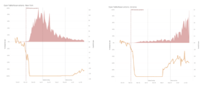
We also looked at year over year comparisons of restaurant reservations through the Open Table platform. Although dine-in restaurants were often ordered closed during the peak of the pandemic, and many still have capacity limits, we can look at the data over the past few weeks to understand how demand is rebounding compared to the relative trends of COVID infections for a given state.

New York has been hit particularly hard by the COVID pandemic, with cases peaking at over 10,000 a day in early April. Despite regions of the state reopening outdoor dining as early as June 4th, restaurant reservations only moderately increased in the month of June. In contrast, Arizona was largely spared from the worst of the first wave of the pandemic. As restaurants in Arizona reopened in May, reservations bounced back much more quickly than New York. However, as case counts increase across the state, the number of restaurant reservations have plateaued and recently have started to drop. It will be interesting to watch these trends as case numbers spike and recede over the next 6 months.
An evolving story
More than three months after the WHO’s official declaration of the COVID-19 pandemic, policy makers, business owners, and community members are still grappling with the question of “Where are we on the path back to “normal?” Leveraging today’s analytical tools and combining diverse, dynamic data sets is key to understanding society’s response to the evolving public health crisis. As more data becomes available, key stakeholders can test their hypotheses, monitor new trends, and better prepare for an uncertain future.
Over the next two weeks we’ll be adding more data to AtScale’s insights model. Check out our COVID-19 insights models and sign up to learn more about what the data is saying about our return to normal.


SHARE
Guide: How to Choose a Semantic Layer